Talking Shop with 3D Archviz Artist Pedro Uriel Del Carmen
We pick the brains of 3D archviz artist Pedro Uriel del Carmen about how honing his methodology took his passion for 3D and turned it into a career.
Read MoreWe pick the brains of 3D archviz artist Pedro Uriel del Carmen about how honing his methodology took his passion for 3D and turned it into a career.
Read MoreWe speak to Pedro Uriel Del Carmen about his project ‘Hacienda San Sebastian’, as well as how consistent methodologies and tips on how to grow as an artist.
Read MoreIt’s time for the round up of the top community artworks from July 2022. All found across ArtStation, Behance, and Instagram by tagging Poliigon:
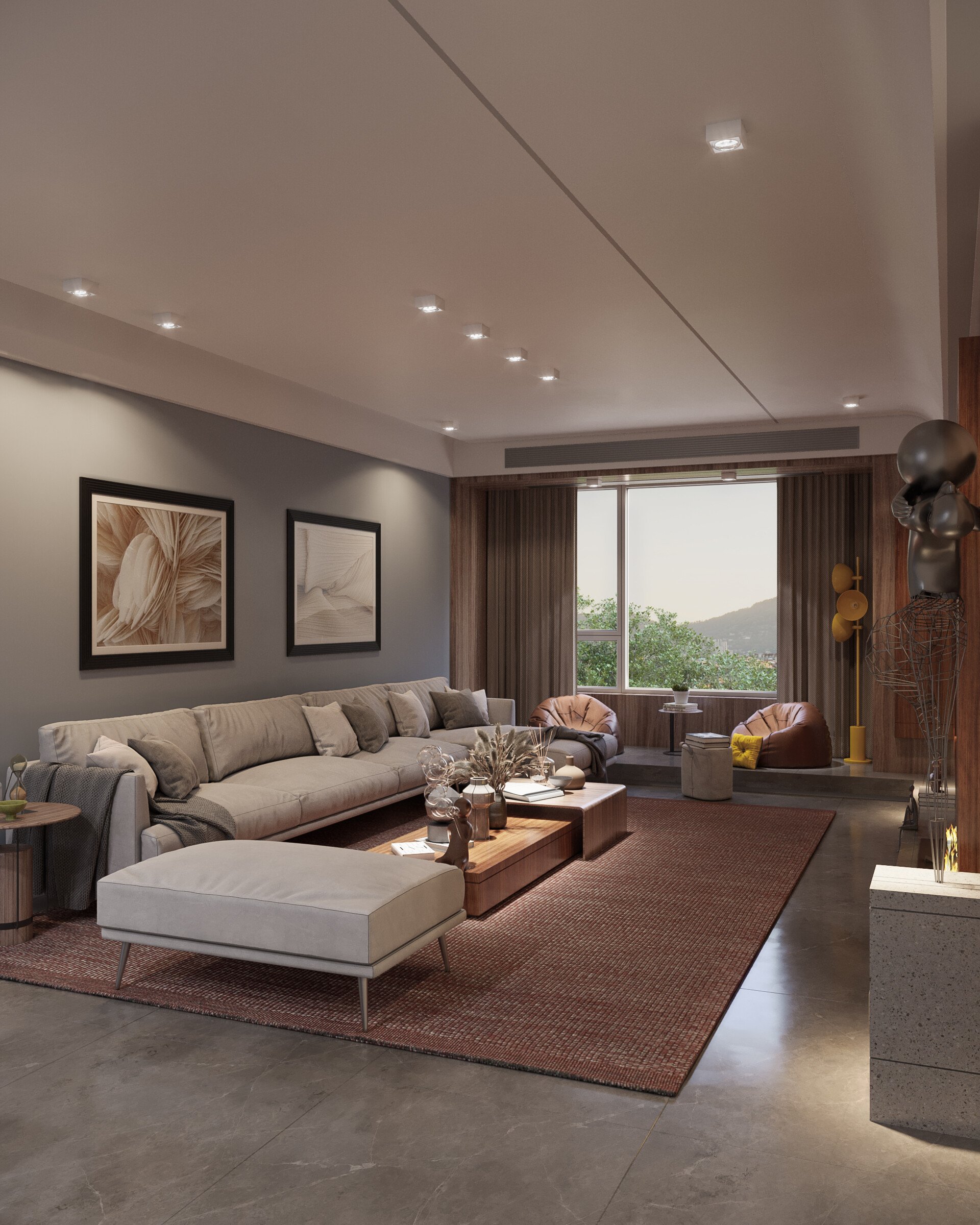
Congratulations to this month’s winner Joao Paulo Lourenco. You’ve won yourself a year of Poliigon Individual (300 Credits) Plan for this set of beautiful images.

Make something awesome that uses Poliigon assets (textures, models, HDRs or brushes)
Post to Behance, Artstation or Instagram, using the tag ‘Poliigon’ (so we can find you)
Check to see if you were featured that month! Winners will also be featured on our social media channels.
If you’re chosen as the best render of the month, you’ll win a free 12-months Poliigon Individual (300 Credits) Plan.
It’s time for the round up of the top community artworks from June 2022. All found across ArtStation, Behance, and Instagram by tagging Poliigon:
Congratulations to this month’s winner Oscar Pastor. You’ve won yourself a year of Poliigon Professional for this set of beautiful images.


Make something awesome that uses Poliigon assets (textures, models, HDRs or brushes)
Post to Behance, Artstation or Instagram, using the tag ‘Poliigon’ (so we can find you)
Check to see if you were featured that month!
If you’re chosen as the best render of the month, you’ll win a free 12-months of the Poliigon Professional plan.
Boucle fabric, recycled materials, and AI designed furniture. These are the top trends I spotted at the 2022 Salone Del Mobile expo in Milan, Italy.
Read MoreLighting is one of the most factors to successful archviz. You can get everything else right - but with poor lighting, it won’t matter. To avoid undermining all that hard work, here are the 7 most common mistakes artists make - and some quick and easy solutions to fix them.
Read MoreIt’s time for the round up of the top community artworks from May 2022. All found across ArtStation, Behance, and Instagram by tagging Poliigon:
Congratulations to this month’s winner Irakli Shubashikeli. You’ve won yourself a year of Poliigon Professional for these beautiful images.


Make something awesome that uses Poliigon assets (textures, models, HDRs or brushes)
Post to Behance, Artstation or Instagram, using the tag ‘Poliigon’ (so we can find you)
Check to see if you were featured that month!
If you’re chosen as the best render of the month, you’ll win a free 12-months of the Poliigon Professional plan.
From photographer and film maker, to woodworker, to 3D hobbyist, to archviz professional; we talk with Yann Verbeke about starting a career in 3D career and all the lessons he learnt along the way.
Read MoreIn an innovative collaboration with a physical product manufacturer, Poliigon has just published ~500 Twinbru fabric textures for curtains and upholstery. Unlike most textures, these are the digital twin replicas of real fabric that can be ordered by the parent company, Bru Textiles.
Read MoreIf you're making an environment, you'll need to scatter lots of objects. Previously, the way to do this was with particles - but the better, more flexible method in Blender 3.0 and above is to use the new Geometry Node feature.
In this article, you’ll learn how to set up a simple Geometry Node system to scatter objects and do some customizations most common for environments, like randomizing rotation, scale, and weight painting.
A plane to scatter onto. We’ll be using a simple plane, but in your scene, it may be your ground surface or whatever object you want to scatter objects onto.
Something to scatter! We’ll be using a selection of rocks from Poliigon.com
Design along with us by watching the video above, or slow it down with the written version below.
Select whatever object you want to scatter objects on to - in this example, we’re using a simple plane primitive.

Jump over to the Geometry Nodes tab, something that was added to Blender in version 3.0.

From there, you can click on the NEW button to create a new set of geometry nodes. It will also add a geometry node modifier to your target object automatically.

There’s almost unlimited potential for what you can create and do using geometry nodes, but these three nodes will be used time and time again. Here’s what they do in more detail:

Distribute Points on Faces
This node creates a random series of points covering the faces of the target object. There are a whole bunch of settings to play with, but we’ll explore those in more detail once we have the basic scattering setup in place.
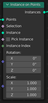
Instance on Points
This node is used to add instances of geometry onto the points created by the Distribute Points on Faces node. There are controls for rotation and scale, as well as some other more advanced options that will not be covered in this article.

Join Geometry
This node does exactly what it says - it joins two separate parts of our node group together. In this example, we’ll be using it to display our original target object as well as the scattering objects we add.
The above setup gives us everything we need to get scattering! We have a:
Distribute Points on Faces node to randomly create points over our object.
Instance on Points node to use those points for distributing instances of our scatter objects.
Join Geometry node so we can see both our scatter objects and our original plane.
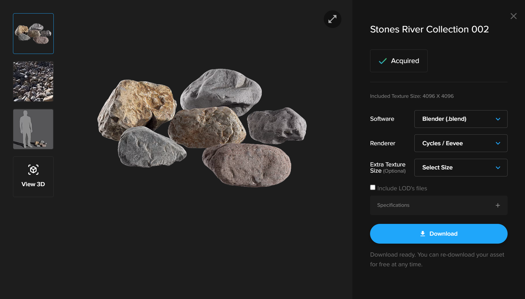
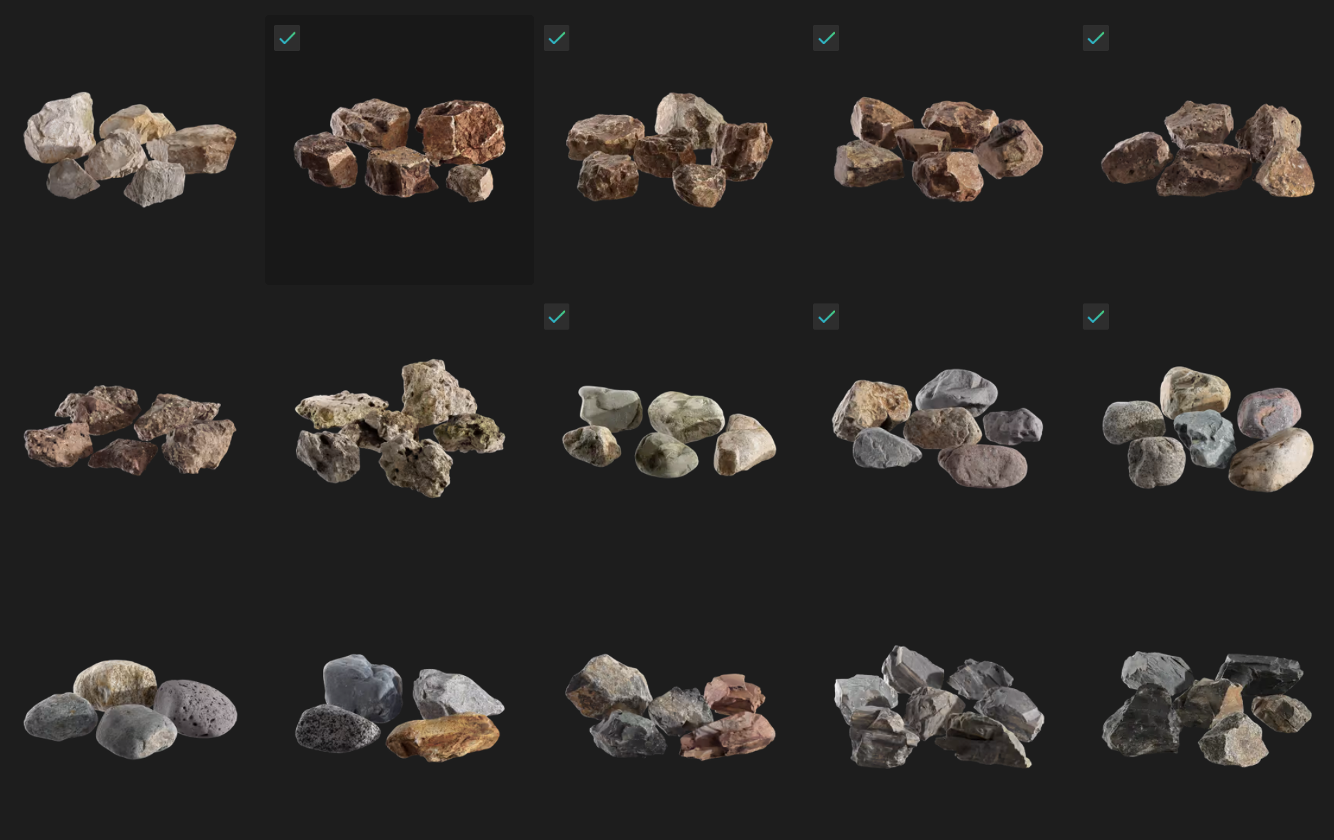
We need some objects to scatter onto our target object. In this example, we’ll be using the Assorted River Stone Models Collection from Poliigon, though for an actual scene you’d want more variation than this by creating multiple systems for different scattering groups.
Thankfully, Poliigon has a whole host of options - you can download a few here if you want to follow along.
Once you have the scatter objects you want downloaded, append them into Blender either by dropping the .blend onto your viewport, or by using the File > Append menu.
Whatever objects you pick, make sure they are all assigned to the same Collection.

Finally, we need to be able to reference this collection of scatter objects within our Geometry Nodes. You can do this by dragging the collection from the overview into your node panel. This will automatically create a pre-setup Collection Info node.
Alternatively, you can just add in a Collection Info node and manually select the appropriate collection.
All that’s left is to connect the output of the Collection Info node into the Instance input on the Instance on Points node.
Also be sure to mark the Separate Children, Reset Children, and Pick Instance checkboxes. This will make sure that each scatter object is treated as an individual and that none of its current position or rotation is used.
If you’ve followed along correctly, you should see something like this:

We’re getting there, but we need more control over the scattering. We’re going to use a node found in the Utilities category called Random Value. This allows us to generate a random value for each point in our setup.

For rotation, change the first Random Value node to a Vector using the dropdown. Then, connect the output to the Rotation input on our Instance on Points node.
Leave all the min values at 0.
For the max values, use:
0 for X
0 for Y
For Z, type in “tau” or 6.283 (which is Pi times 2) - because the value is in radians, this will give us a total max rotation of 360 degrees for our scatter objects.
For scale, leave the second Random Value node as a float value, which is its default. Connect it directly to the Scale input of the Instance on Points node. Yes, this will mean connecting a gray Float output to a purple Vector input, but it’s nothing to worry about - it’ll just mean that each of the X,Y, and Z values of the vector will reference the same float value, which is exactly what we’d want to ensure our scatter objects maintain their shape and aren’t distorted along any axis.
For the Min Scale Value, we’ll use 0.7 as we don’t want too much variation. We can leave the Max Value on its default of 1. Be careful to never use a Min Value of 0 here as, you won’t see objects that are a 0 scale, but they will still be calculated, which will slow down your render and increase resource usage.
This should be the result, if followed correctly:

I mentioned earlier we’d be taking a look at this node in more detail. Now is that time!

The type by default is set to random - which isn’t really ideal for scattering. Instead, change this to Poisson Disk - this creates some additional controls that we’ll be making heavy use of.
The first one we want to adjust is the Density Max value. As you increase this value, you’ll see more and more scattered objects. A good technique here is to keep increasing the number until most of your surface is covered with objects. You’ll notice that a lot of them will be clipping inside its neighbor - this is something we’ll address next.
For the Distance Min value, we want to use a value of around 0.03m, though it’ll vary depending on the scattered object. Basically, it’ll mean that any two objects that are closer than the desired amount will have one of the objects omitted.
It’s a balancing act between these two values to get the right result. You’ll always have some clipping in most cases, but you should be able to effectively minimize it.
The final value we want to look at here is the Density Factor. This is essentially a multiplier for the Density Max value. A value of 0.5 here would give us half the total amount, for example.
What use is this, you ask? Well, notice how it has a little diamond input rather than the normal circular blob? This indicates that a per-point value can be used here - i.e. we can use a texture, a weight paint, or a more per-point node calculation. It’s the Weight Paint we’re interested in, so for now, connect the Density Factor to a new group input.

Before we can paint our weight paint, we need to make sure the object has plenty of geometry to paint on, because a weight paint is just assigning values to a vertice. In this example, I’m just going to subdivide my plane by pressing the RMB on our object in Edit Mode, selecting Subdivide, and then entering in 100 as the number of cuts.

With that done, just jump over to the Weight Paint tool and paint in where you would like the scatter objects to go.
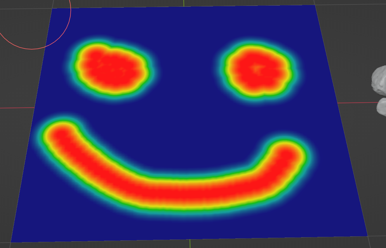
While we are using a weight paint in this example, a painted texture would work just as well and use the exact same method.
An optional but advised step here is to name the newly created vertex group. I’ve called mine ‘Rocks’.

All that’s left now is to send the information within this vertex group to the Density Factor input in our geometry node setup - this is why we created a new group input for it. This is now listed in the Geometry Nodes modifier and all we have to do is assign our vertex group to that input. In my case, that meant selecting the Rocks vertex group.

And that, as they say, is that - we have our quick, simple scattering setup that you can replicate over and over for all the various scattering groups you might need in your scene - grass clumps, flowers, plants, rocks, debris, pretty much anything you could think of.
Happy scattering, folks!
It’s time for the round up of the best community artworks from April 2022. All found across ArtStation, Behance, and Instagram by tagging Poliigon:
Congratulations to this month’s winner Vic Nguyen. You’ve won yourself a year of Poliigon Professional for this rustic interior!
Make something awesome that uses Poliigon assets (textures, models, HDRs or brushes)
Post to Behance, Artstation or Instagram, using the tag ‘Poliigon’ (so we can find you)
Check to see if you were featured that month!
If you’re chosen as the best render of the month, you’ll win a free 12-months of the Poliigon Professional plan.

You’re admiring your latest render. The models look great. There’s bevels on everything. No shading issues. But something feels off.
Ah, yes. You’re not finished.
Taking an image from good to great, is something a lot of artists struggle with. So here are 7 helpful tips I’ve learned over my years in professional archviz.
Archviz is not so much about imitating the real world, as it is about creating the utopian vision of it. The lived-in feel comes from people using the space and adjusting it to their needs over time, not from random “stuff”.
The more clutter in your scene, the less any individual element can stand out. In general, less is often more. Be choosy and only place objects that complement or add to the story.
If it’s not cemented to the floor, you can reposition items to suit the composition of each shot. Professional architectural photographers do this all the time.
Archviz renders often have idyllic sunny or overcast lighting as it tends to make the natural colors of the objects pop. But what many artists forget is that lighting also limits the choices you can make when it comes to the 3D assets used to tell your story.
All plants have slightly different tints so your choices will depend on whether you want them to pop out or blend in. For example, in a dark living room, adding a plant with dark, deep green leaves won’t shift the scene’s focus but that same plant can be an amazing focal point when the walls are painted light.
Plants tend to make a space appear calmer, but if you already have high-frequency details in your scene like busy background, adding a plant with small or detailed leaves (e.g. monstera, palm, ficus benjamina, or bamboo) might cause the scene to look too busy. Plants with large, uniform foliage (e.g. strelitzia/bird of paradise or fiddle-leaf fig) are safer options for adding life and color to a scene or can be used to balance out busier plants.
This is crucial, especially when aiming for an image that feels realistic. Not a single plant thrives in a dark windowless bathroom, so only place them where sunlight would reach: near windows, doors etc.
To sum it up, making interiors inviting involves a lot more than just throwing in some decorative items. It’s a delicate balance between personality and aesthetics, which can make or break the final image.
You’ll need practice, but it gets easier with every attempt.
We speak to Arnaud Imobersteg about what it took to break into the architectural visualization industry as a designer and illustrator.
Read MoreIt’s the third roundup of 2022! Here are the top community artworks from March 2022, found on ArtStation, Behance, and Instagram by tagging Poliigon:
Congratulations Thijs de Bruin. You’ve won yourself a year of Poliigon Professional for this stunning set of images.

House Plants Study by Thijs de Bruin


Make something awesome that uses Poliigon assets (textures, models, HDRs or brushes)
Post to Behance, Artstation or Instagram, using the tag ‘Poliigon’ (so we can find you)
Check to see if you were featured that month!
If you’re chosen as the best render of the month, you’ll win a free 12-months of the Poliigon Professional plan.
We speak to Arnaud Imobersteg about his project ‘The Shanty Stack’ and learn how careful scene-planning and clever post processing can streamline your workflow.
Read MoreWe reached out to 7 archviz professionals in our community and asked them a question for the future generations: What’s been the most important lesson you’ve learnt as a 3D artist, that you would pass onto other aspiring artists? Here’s what they had to say.
Read MoreIt’s the second roundup of 2022! Here are the top community artworks from February 2022, found on ArtStation, Behance, and Instagram by tagging Poliigon:
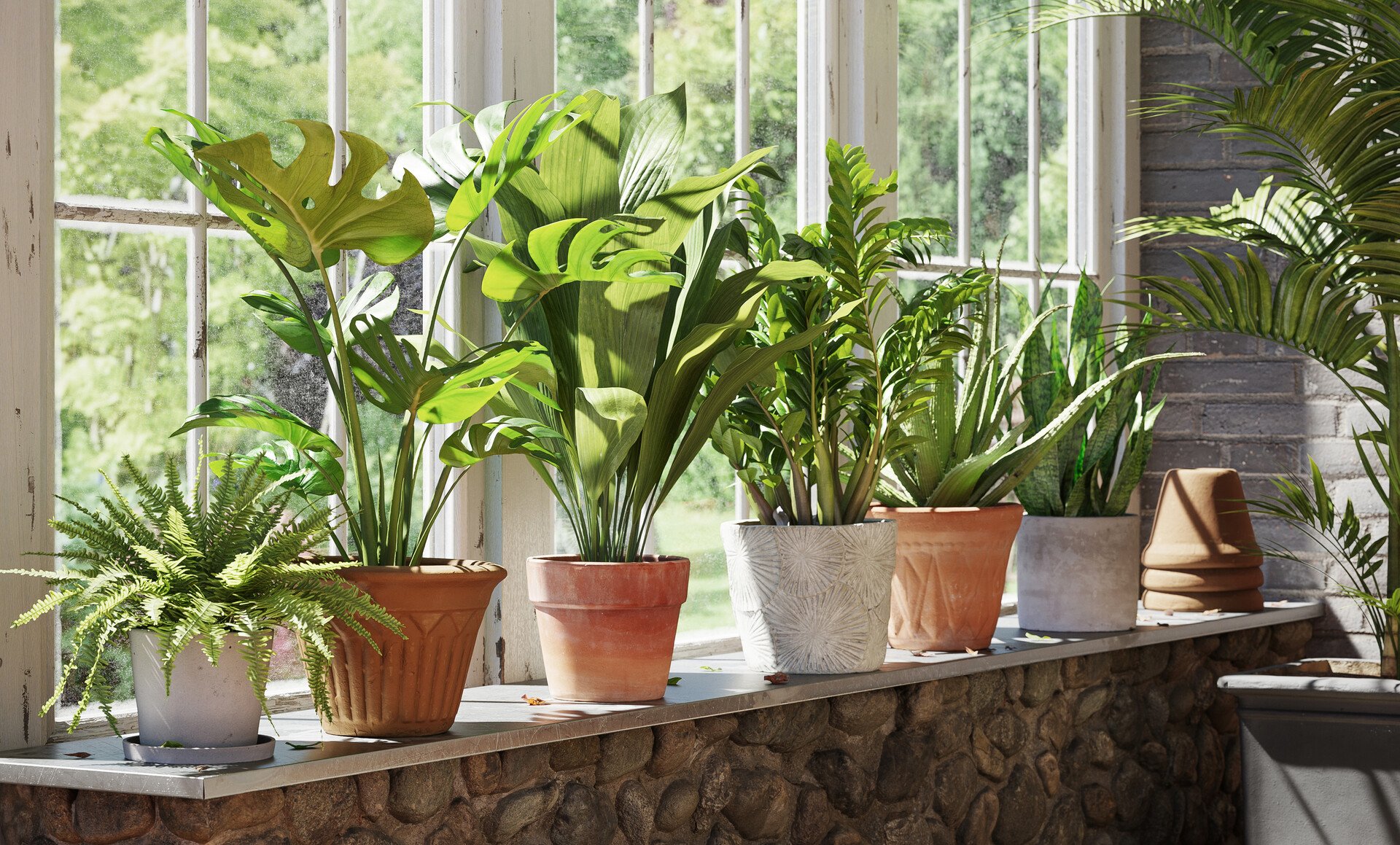
Congratulations Piotr Kostyła! You’ve won yourself a year of Poliigon Professional for this beautiful set of images featuring a number of our interior plant assets.


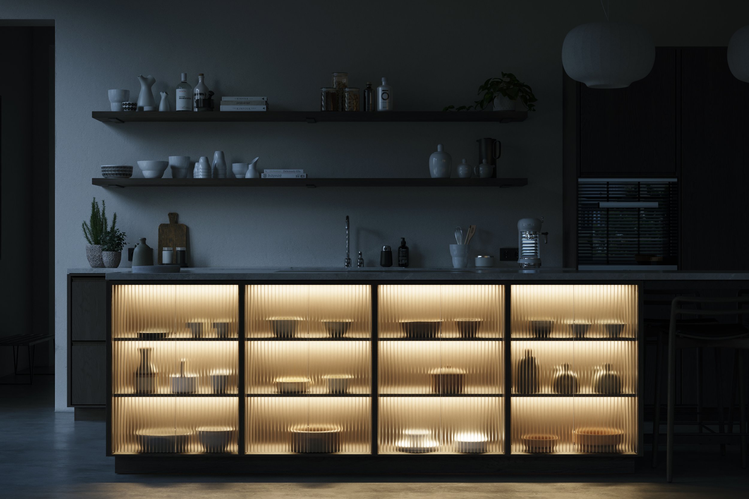
An honorable mention goes to our talented colleague, Poliigon employee Philip Moreton, who created this full apartment scene inspired by the interior design work of Annabell Kutucu.


Make something awesome that uses Poliigon assets (textures, models, HDRs or brushes)
Post to Behance, Artstation or Instagram, using the tag ‘Poliigon’ (so we can find you)
Check to see if you were featured that month!
If you’re chosen as the best render of the month, you’ll win a free 12-months of the Poliigon Professional plan.
From their very first attempts at extruding faces, to where they are now, check out how these ArchViz professionals turned their passionate hobbies into a career in 3D Visualizaition.
Read MoreIt’s the first roundup of 2022! Here are the top community artworks from January 2022, all found on ArtStation tagging Poliigon:
Congratulations Angel Kostov! For this beautiful set of images you’ve won yourself a year of Poliigon Professional.
Make something awesome that uses Poliigon assets (textures, models, HDRs or brushes)
Post to Behance, Artstation or Instagram, using the tag ‘Poliigon’ (so we can find you)
Check to see if you were featured that month!
If you’re chosen as the best render of the month, you’ll win a free 12-months of the Poliigon Professional plan.
It’s the final roundup of 2021! Here are the top community artworks from December 2021, all found on ArtStation tagging Poliigon:
Congratulations George Turmanidze! For this beautiful set of images you’ve won yourself a year of Poliigon Professional.


Make something awesome that uses Poliigon assets (textures, models, HDRs or brushes)
Post to Behance, Artstation or Instagram, remembering to tag ‘Poliigon’ (so we can find it)
Check to see if you were featured that month!
If you’re chosen as the best render of the month, you’ll win a free 12-months of the Poliigon Professional plan.