New Metal Materials

Most materials in the world are dielectric, which means they have both diffuse and gloss.

But metal is different, because it doesn't refract any light. Meaning there's no diffuse, metal is actually 100% gloss!

Yet when you look online for "metal textures" you'll find mostly diffuse textures!

So what gives!?

Well since there's no diffuse in metal, photographing it is almost impossible.

So instead of photographing them, we created them from scratch using Substance Designer. This allowed us to create interesting roughness & displacement maps that you see the effects of in real metal, but can't capture with a camera.

This has created a collection of some ultra realistic metal that truly looks the way it does in real life.

From raw metal like copper, brushed metal and steel:

To hybrid materials like rusted chipped paint:

The library is always growing, so join us to get this release and future releases like it!

Poliigon turned 1! Here's what's next...

This time last year, we tried to address the problem that every 3d artist faces: converting a texture into material maps takes forever!

So we created Poliigon, and launched it in May 2016 as a fully featured material library:

We said that you could plug them into any 3d software and get photorealistic materials in seconds:

And in the first month 200 people agreed with this mission!

The following few months were slow, but picked it up speed in November '16 when we started announcing Monthly Material Releases. And this growth has continued every month thereafter!

The really crazy thing though? If we continue at this rate, we'll be nearly DOUBLE our size by the end of the year!!!

So we're planning to use this revenue to hire more photographers and more artists, to produce more content for you.

But we need your help! 

We want to know how we can best serve you...

  • What textures do you want more of?
  • What different asset types would find useful?
  • How can we over-deliver?

Let us know by answering this quick survey.

It'll take just 3 minutes, but it will help us create the content you want to see!

From everyone here at Poliigon, thanks for this last year! Here's to many, many more! :)

Top community Renders from April 2017

Another month has passed, so there's another batch of awesome renders from the community!

Here's our favourite renders by Poliigon users in April:

Created by Thomas Berard using Blender. Love the interior design! A really bold industrial look, but still cozy. Nice one!

Created by Thomas Berard using Blender. Love the interior design! A really bold industrial look, but still cozy. Nice one!

Created by Fabrizio Luchetti using 3dsmax and Corona Renderer. That fabric looks incredible! Total show stealer :P The wrinkles really help to sell the believability of the rest of the scene. Well done!

Created by Fabrizio Luchetti using 3dsmax and Corona Renderer. That fabric looks incredible! Total show stealer :P The wrinkles really help to sell the believability of the rest of the scene. Well done!

Created by Iván Zabalza González using 3dsmax and Corona renderer. Nice work making the scene feel lived in. The leather chair looks comfy :)

Created by Iván Zabalza González using 3dsmax and Corona renderer. Nice work making the scene feel lived in. The leather chair looks comfy :)

Created by Ján Morek using Blender. Great use of the tree backdrops to make the scene look expansive. The rest of the scene is great as well. Love that blue hour lighting :)

Created by Ján Morek using Blender. Great use of the tree backdrops to make the scene look expansive. The rest of the scene is great as well. Love that blue hour lighting :)

Created by George Turmanidze using Blender. Nice use of the new wooden floor textures! As usual the soft lighting really helps draw attention to the forms of your furniture. Great setting :)

Created by George Turmanidze using Blender. Nice use of the new wooden floor textures! As usual the soft lighting really helps draw attention to the forms of your furniture. Great setting :)

Created by Amer Farah using 3dsmax and Vray. Wow! What a captivating image! You clearly spent many hours honing everything from the tire tracks to the people. The end result looks like it's lifted out of a top-end architectural magazine. Well d…

Created by Amer Farah using 3dsmax and Vray. Wow! What a captivating image! You clearly spent many hours honing everything from the tire tracks to the people. The end result looks like it's lifted out of a top-end architectural magazine. Well done!

Render of the Month:

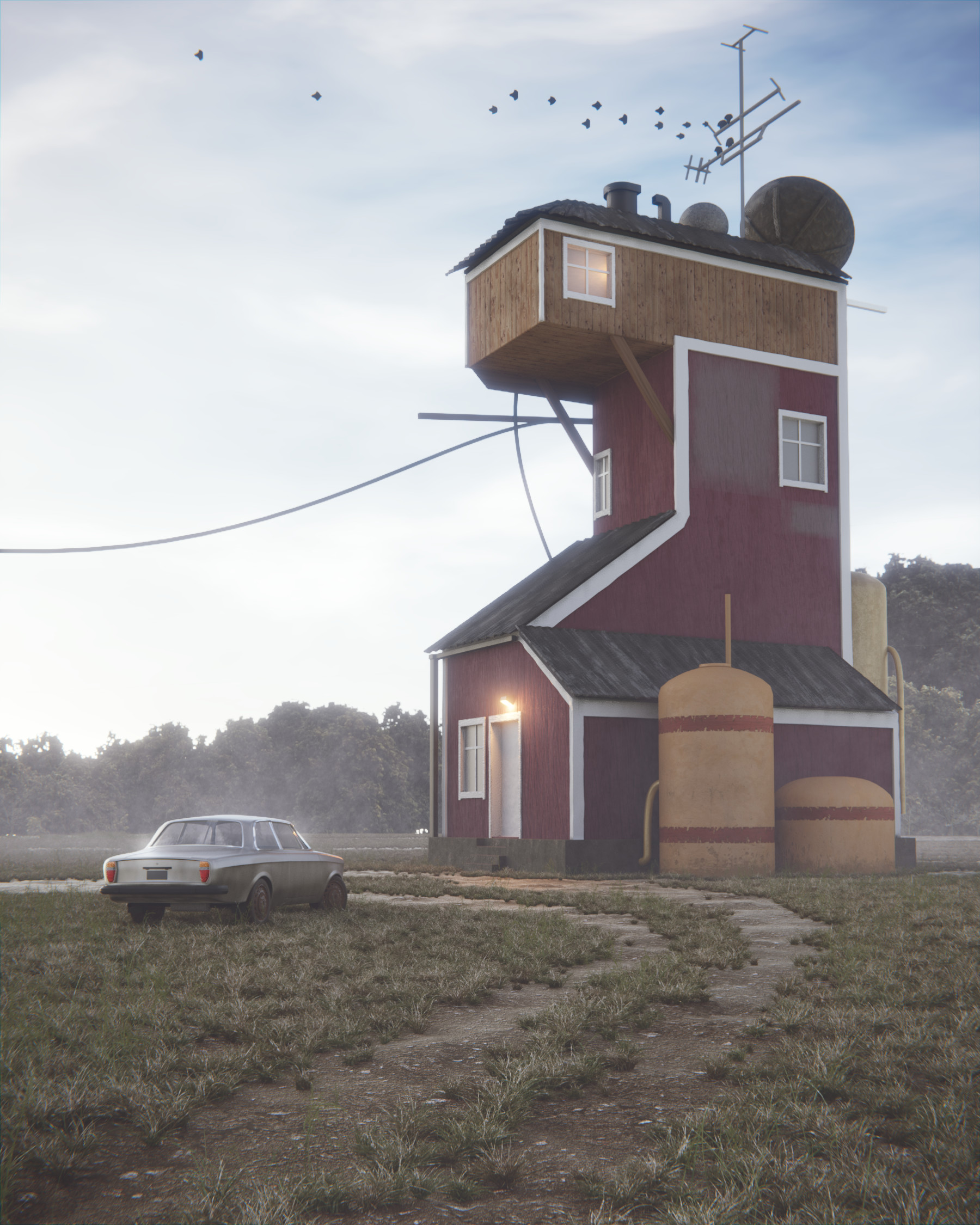
Created by Marcin Borowiak using 3dsmax, World Machine and Corona Renderer.

Created by Marcin Borowiak using 3dsmax, World Machine and Corona Renderer.

There can only be one winner, and that's Marcin, who made this entire scene using Poliigon's snow, road, cobblestone, overlays, rock textures and even HDR sky lighting! I love the motion in the scene, as you can really feel the movement of the car (I just hope he makes it around that corner up ahead :P).

Great job Marcin! As your prize you've won 12 months free Gold Membership to Poliigon!

How to Feature Here Next Month

  1. Create an awesome images that uses at least 60% Poliigon textures
  2. Post it to ArtStation with the words "Textures from Poliigon.com" somewhere in the description.
  3. At the end of the month we'll round up the best renders and award the top winner a free Gold Membership to Poliigon!

We pick a new winner every month, and anyone can win (yes even trial members!).

Big thanks to everyone who posted their work in the last month. Looking forward to seeing what you all cook up in May :)

New Imperfection Textures

Clean surfaces are the bane of 3D art.

Because while the real world is full of randomness in every material, 3D software creates clean straight surfaces by default. As a result, we're often left wondering why our render doesn't look like a photo. Hint: It's because it's too perfect!
Since all existing "grunge" textures we could find online weren't suitable for 3d rendering, we decided to create something that was made for 3D artists: a surface imperfection library.

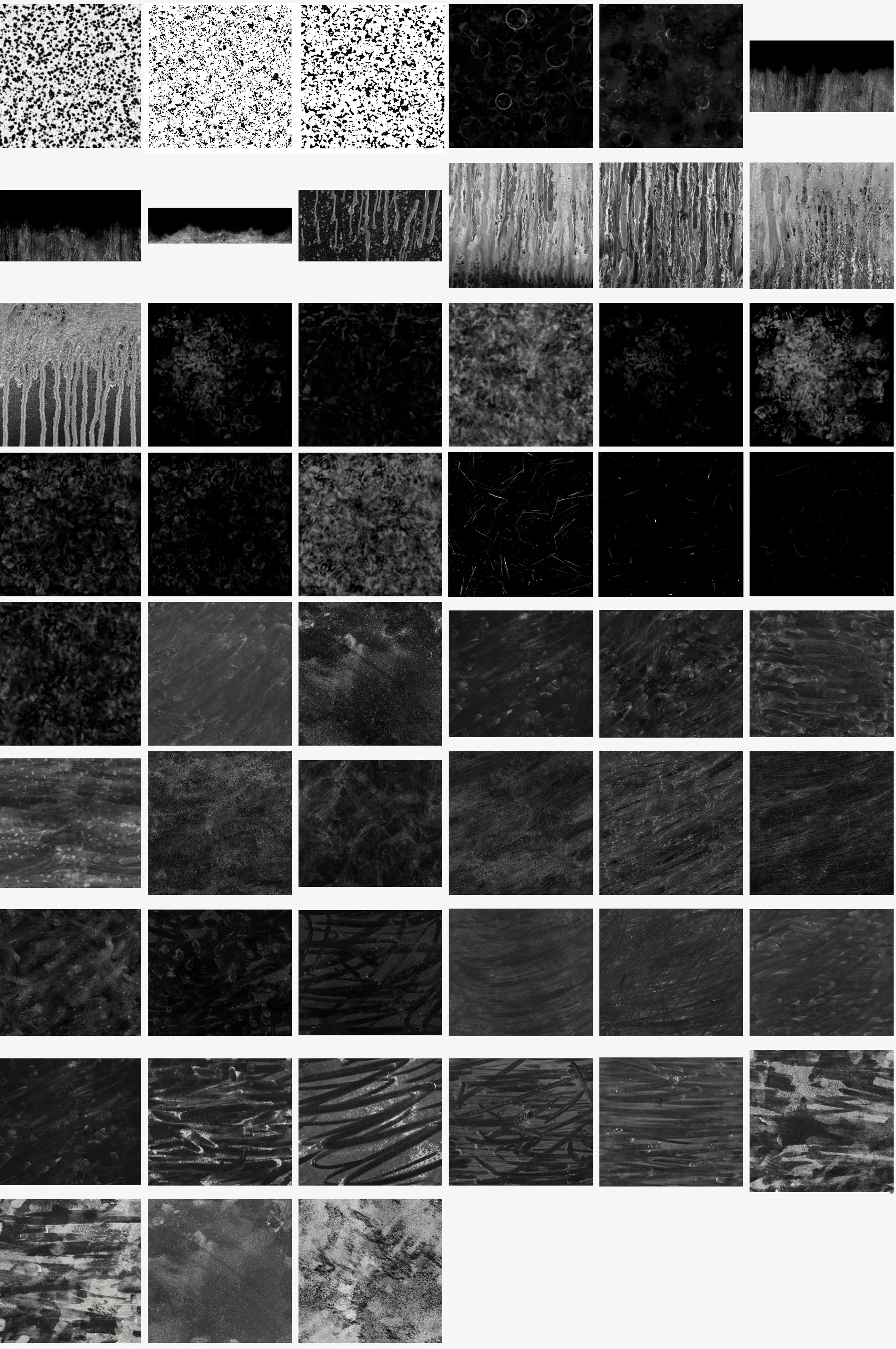
We've had this library since launch, but for our April release we added 51 new textures to the surface imperfection section.

There's new textures like tabletop stains, weaponry scratches and dirt wipes

As well as new variations to existing maps, like making the fingerprints and footprints zoomed out in scale so you can use them on larger objects.

Oh and this is our 6th Month of texture releases! Woo! Time flies.

Can't wait to show you what we've got in store for the future :)

Join Poliigon to get more texture releases like this.

Top Community Renders from March 2017

The bar has officially been raised!

Check out what Poliigon users posted on ArtStation this past month:

By Jonatan Mercado using Blender and Cycles. 

By Jonatan Mercado using Blender and Cycles. 

Beautiful fog! You captured that early morning feeling very well :) Nice use of the ground and wood materials!

By Max C. Detourniere using Blender.

By Max C. Detourniere using Blender.

Gorgeous lighting! Perfect use of the new wood materials and overlay textures.

By Armando Tello using Blender and Cycles.

By Armando Tello using Blender and Cycles.

So simple, yet still beautiful. You used those new wood materials perfectly!

By Marcin Borowiak using 3dsmax and Corona Renderer.

By Marcin Borowiak using 3dsmax and Corona Renderer.

The contrast between the gritty tarmac and the smooth colorful car is wonderful. Great use of the road materials!

By Armando Tello using Blender and Cycles.

By Armando Tello using Blender and Cycles.

The texturing on that wooden spin top couldn't look any more perfect! Really well done. Great use of the wood materials and overlay textures.

By Armando Tello using Blender and Cycles.

By Armando Tello using Blender and Cycles.

Simple yet beautiful! Nice use of the brick and ground materials.

By Anton Yeregui using 3dsmax and Corona Renderer.

By Anton Yeregui using 3dsmax and Corona Renderer.

Fantastic lighting! So clean yet still interesting. That food must have taken a while to get right!

Render of the Month

By Heverton da Silva using Blender and Cycles.

By Heverton da Silva using Blender and Cycles.

Just gorgeous! That lighting is beautiful. Fantastic use of the new wood flooring materials and designs. Hope to see more from you in the future!

For his hard work, Heverton has won himself a free year of Gold membership to Poliigon!

How to Enter Next Month's Competition

Every month we choose the best render made with Poliigon materials and award them a free Year of Gold Membership (valued at $168). Here's how to win:

  1. Make something awesome that uses at least 60% Poliigon materials and textures
  2. Post it to ArtStation
  3. Include the words "Textures from Poliigon.com" somewhere in the description

At the end of the month we'll roundup our favourite images and award the winner their prize!

New Fabric Materials

Fabric is everywhere. We walk on it, we clothe ourselves in it, and dry ourselves off with it.

Yet making realistic fabric in 3d, has always been challenging. Even with dedicated cloth simulators like Marvelous Designer, getting the materials right is difficult.

At Poliigon, we were tired of the existing fabric textures online, and wanted to create something better.

So we started by inspecting fabric samples under a microscope, paying close attention to their weave patterns and thread counts.

Then instead of photographing them, we recreated them in Substance Designer.

Much like Tiles, Wood and Marble, Fabric benefits from being created digitally, as the detail is simply too tiny to photograph correctly!

This enabled us to tweak the fabric to perfection, right down to the thread count.

There are 25 new fabric materials:

Which are perfect for clothing:

...furniture:

...and even packaging materials :)

As per usual, they work in any 3D software. Just download the maps and use like you normally would.

New Material Previews

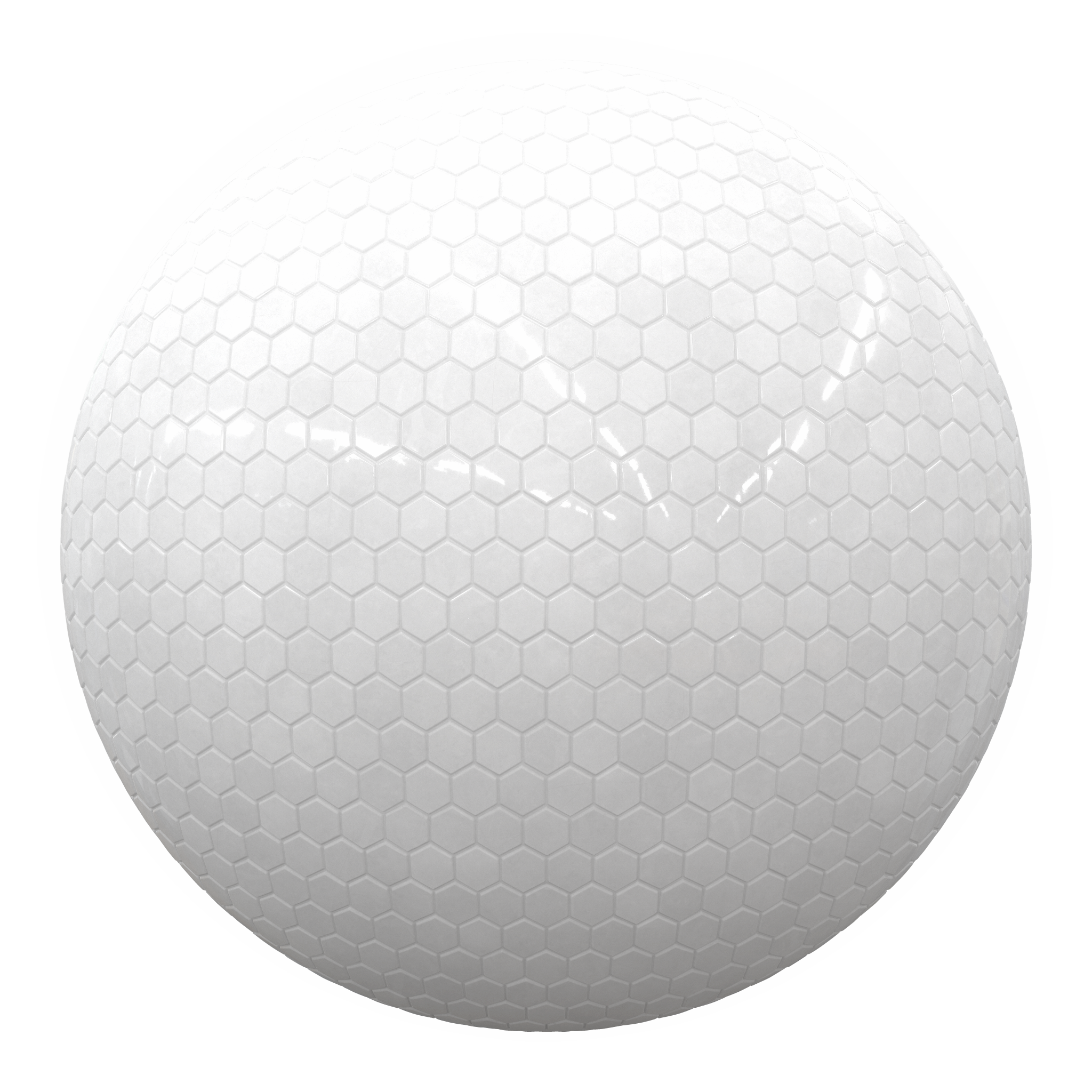
It's been a long time coming, but Material Previews are now available on Poliigon!

Why Material Previews?

When you're searching for the right material, you want to know it will look in the final render. And maps often fail at showing this. Which means you might download the material and set it up before realizing it's not right.

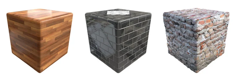
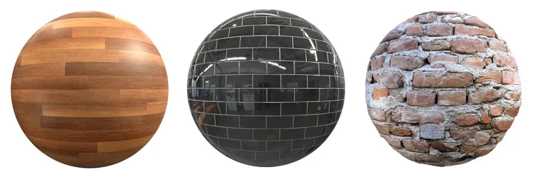
Material previews solve this by accurately displaying how it will look:

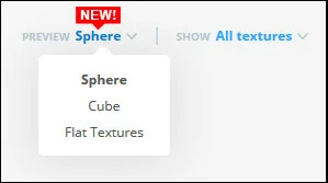
Previews are available in both Cubed and Spherical format.

Cubes are excellent at showing how the material will look in your scene, and spheres are great for showing how it will interact with lighting:

We've also made switching between the various previews incredibly easier, so check out our newly updated pop-up window!

We hope you're now able to find the material you're looking for faster! :)

Top Poliigon Renders from February 2017

Heyoo! The Poliigon community created some more gorgeous renders this past month. So as per usual, here's the monthly roundup of our favourite images:

Love that lighting!Created by Asbjørn Pedersen using the new tile materials in Blender.

Awesome 3D printed rifle concept, by Christian Grajewski, with a unique use of the Overlay textures. Made with Alias design and Keyshot.

Simple but lovely wooden toy, by Lawrence Jaeger using wood materials. Made with Blender.

Created by Nicolas Martinez, using Rhinoceros and Keyshot.

A clean, white bathroom, but still enough character to be interesting. Created by Michał Demps using the new Marble materials. Made with Blender.


And the render of the month is...

Minimalistic yet highly detailed bathroom, by Gaiduk Dmytro using Overlay and Wood materials. Made with Blender.

Great use of the Overlay textures to create a perfectly photorealistic bathroom. I love the condensation on the windows!

For being featured as the Render of the Month, you've won a 12-month Gold Subscription to Poliigon. Congrats!

How to Win Next month

  1. Make something awesome using any of Poliigon's materials
  2. Post it on ArtStation with the words "Textures by Poliigon.com" somewhere in the description.
  3. Check back here at the end of the month to see if you were featured! The best render will receive a 12-month Gold subscription.

Seems the entries are getting better and better each month. Can't wait to see March's :)

New Tile Materials

In the past, creating realistic CG tiles was a pain, because all other texture sites only offered photographs

Which is a problem when you try to convert them into material maps, as the software usually struggles to understand the material correctly.

We've been there, and we wanted some better tiles.

So instead of starting with photographs, we created them digitally with Substance Designer.

It's incredibly time consuming, but it's the only way to get realistic material maps, as we had full control over every aspect of the material.

So we created beveling, height and tilt variation, wear and tear, glossy variation and a bunch of other subtle tweaks to make the tiles look gorgeous.

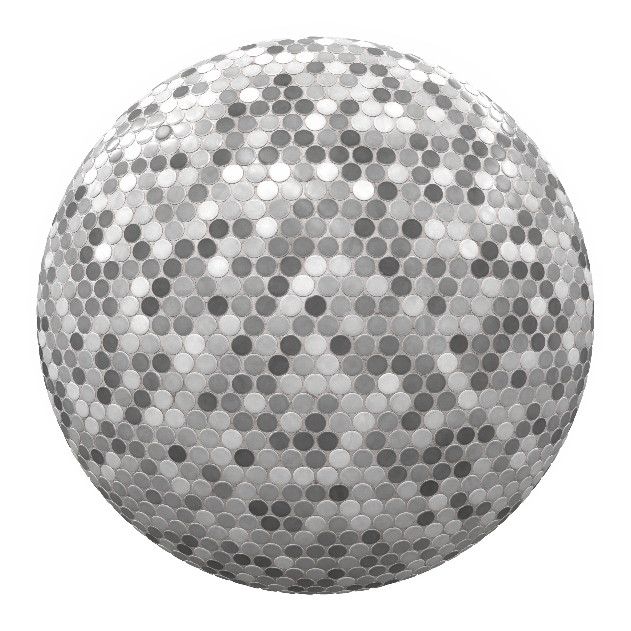
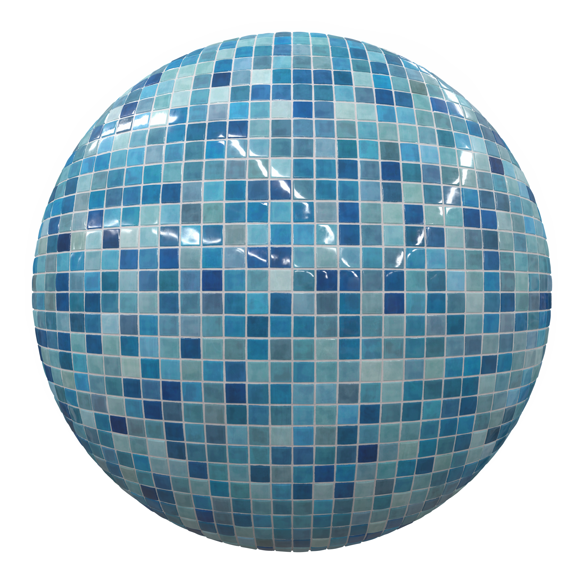
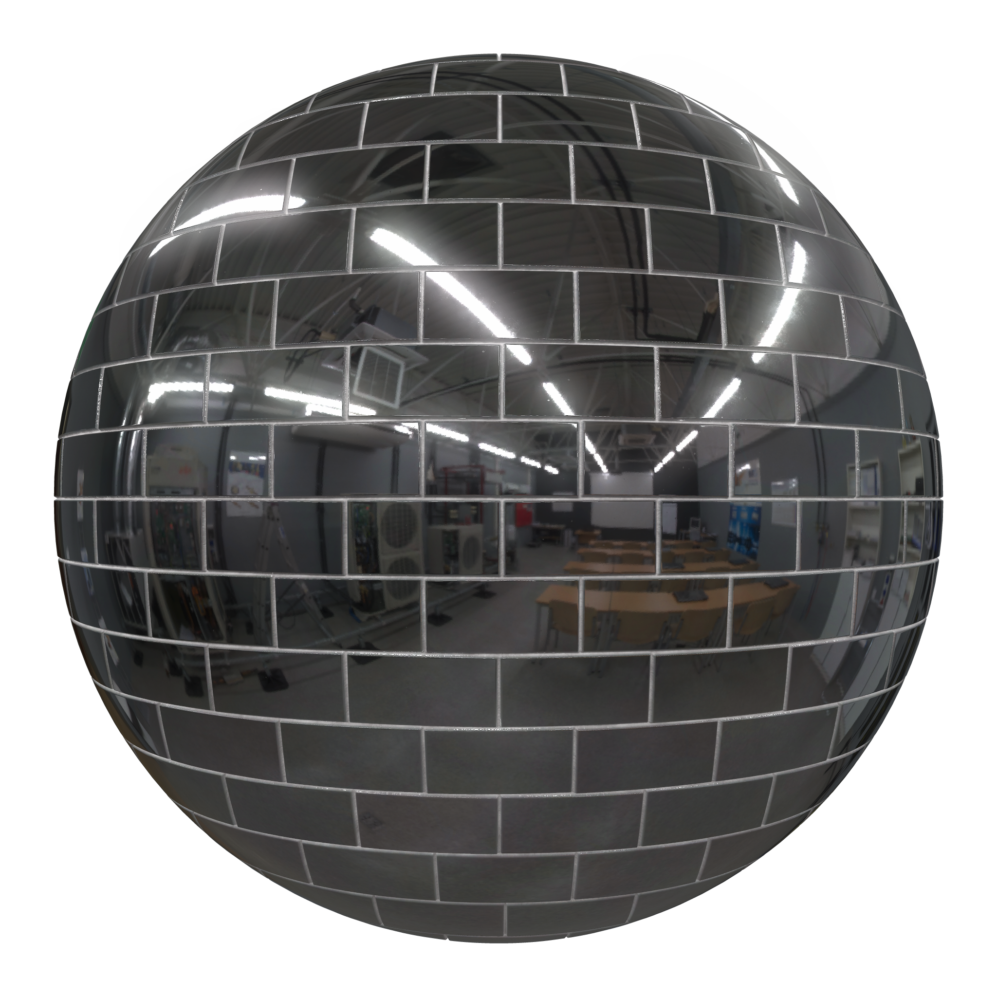
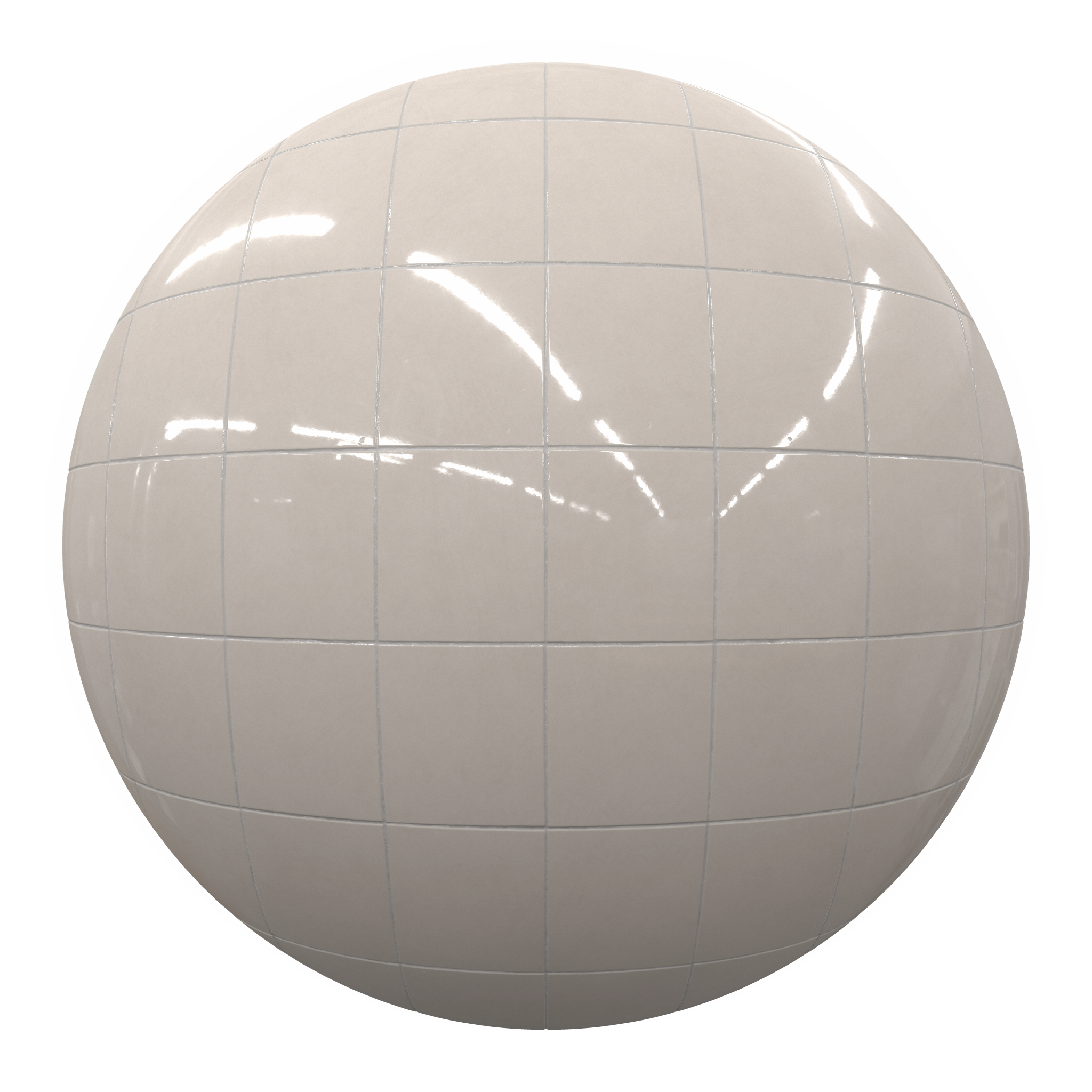
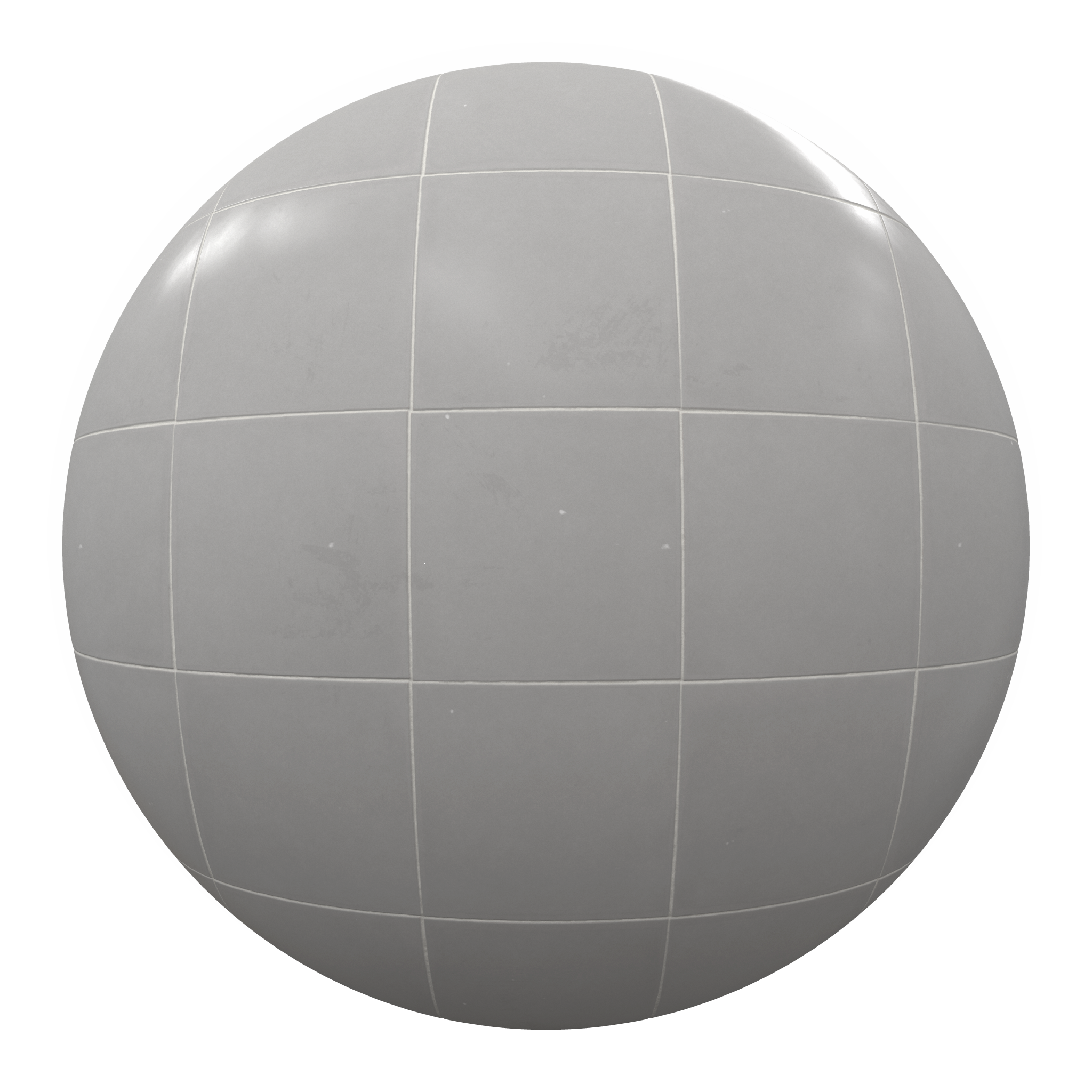
There are 33 new tile materials now available on Poliigon:

Members get them at no extra cost. Download them now!

Not yet a member? Sign up here.

PS. What do you think the next texture pack should be? Vote here.

New Wood Materials

We've just released another wood collection including five seamless, high-res cabin wall materials!

Check out this new fence type with three variations :)

We've also added a sweet cutting board with the side edges included and more!

Top Poliigon Renders from January 2017

Can you believe one month has already passed since the start of 2017? Boy does time fly. 

In the past month we've seen some stunning works of art by the Poliigon community, and so as per usual, here's our favourite renders:

by Alex Jeorg. Simple but beautiful! Love that smudged glass texture!

by Ikan Otnemrop. Nice use of volumetric lighting! Really nice setting.

by Nicolas Martinez. Cool idea! Nice texturing on the phone (a little heavy, but still nice!)

by Nicolas Martinez. Cool idea! Nice texturing on the phone (a little heavy, but still nice!)

by Miguel Rojo. Very clean, and easily readable image. The wood and lamp texturing is great :)

by Miguel Rojo. Very clean, and easily readable image. The wood and lamp texturing is great :)

by Nick Brunner. Nice use of photoscanned grounds! The grass peaking through the rocks is a nice touch :)

by Nick Brunner. Nice use of photoscanned grounds! The grass peaking through the rocks is a nice touch :)

And the winner is...

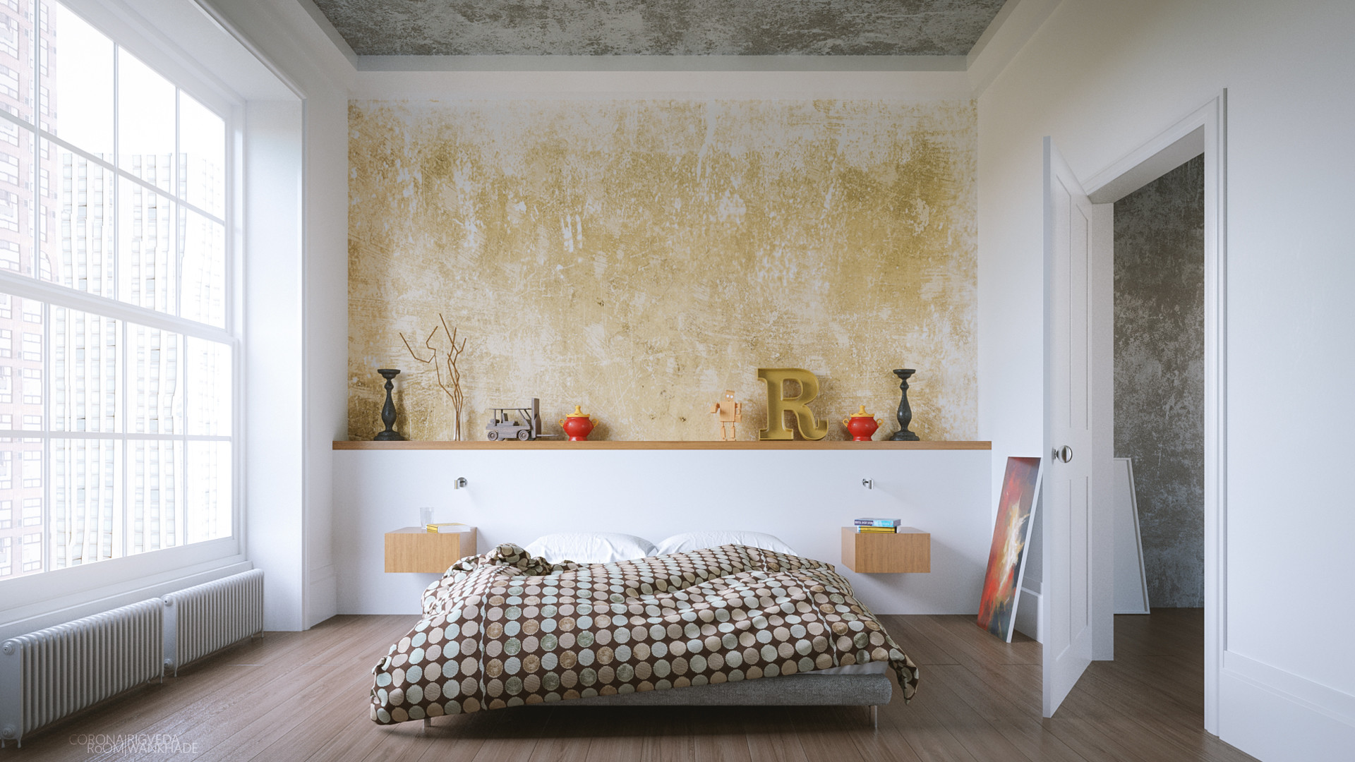
by Rigveda Wankhade.  Beautiful lighting and decor! It's minimalistic, but with enough detail that it doesn't feel boring. Overall a great looking render.

by Rigveda Wankhade.  Beautiful lighting and decor! It's minimalistic, but with enough detail that it doesn't feel boring. Overall a great looking render.

Congrats Rigveda! You've won a 12-month Gold Subscription to Poliigon!

How to Win Next Month

Step 1: Create an artwork that uses at least 60% Poliigon textures. Any subject is fine!

Step 2: Post your artwork to ArtStation, with the words "Textures from Poliigon.com" somewhere in the description.

Step 3: Wait until the end of the month, to see if you've been chosen as the best render! One winner will be selected every month.

May the best artist win! :)

New Feature: Sky HDRs

Lighting is a big deal.

It can mean the difference between an image that feels unnatural, and one that feels alive and welcoming:

But unfortunately, most outdoor lighting setups look pretty terrible.


Why most outdoor lighting looks bad

The most common approach to outdoor lighting is to use a sun lamp and a blue environment light. Which is a step in the right direction, but it's too simple. Because - as with many things in CG - the real world is much more chaotic.

A sky isn't just blue. Thanks to clouds, and the physics of light, it's a million different shades of blue, white and yellow. All with differing amounts of saturation and value.

Run an eyedropper over a photo of a sky and you'll see what I mean:

That's a huge amount of variance for something most of us perceive as "blue"!

When your sky lacks this detail, it impacts not only the lighting but also the reflections.

And since all objects are reflective, a solid blue color looks pretty laughable in a reflection:

Simply put, without a real sky, you're missing out on glorious detail in the reflections and the lighting.

So how can we get all this extra complexity in our renders?


The Solution: HDRs

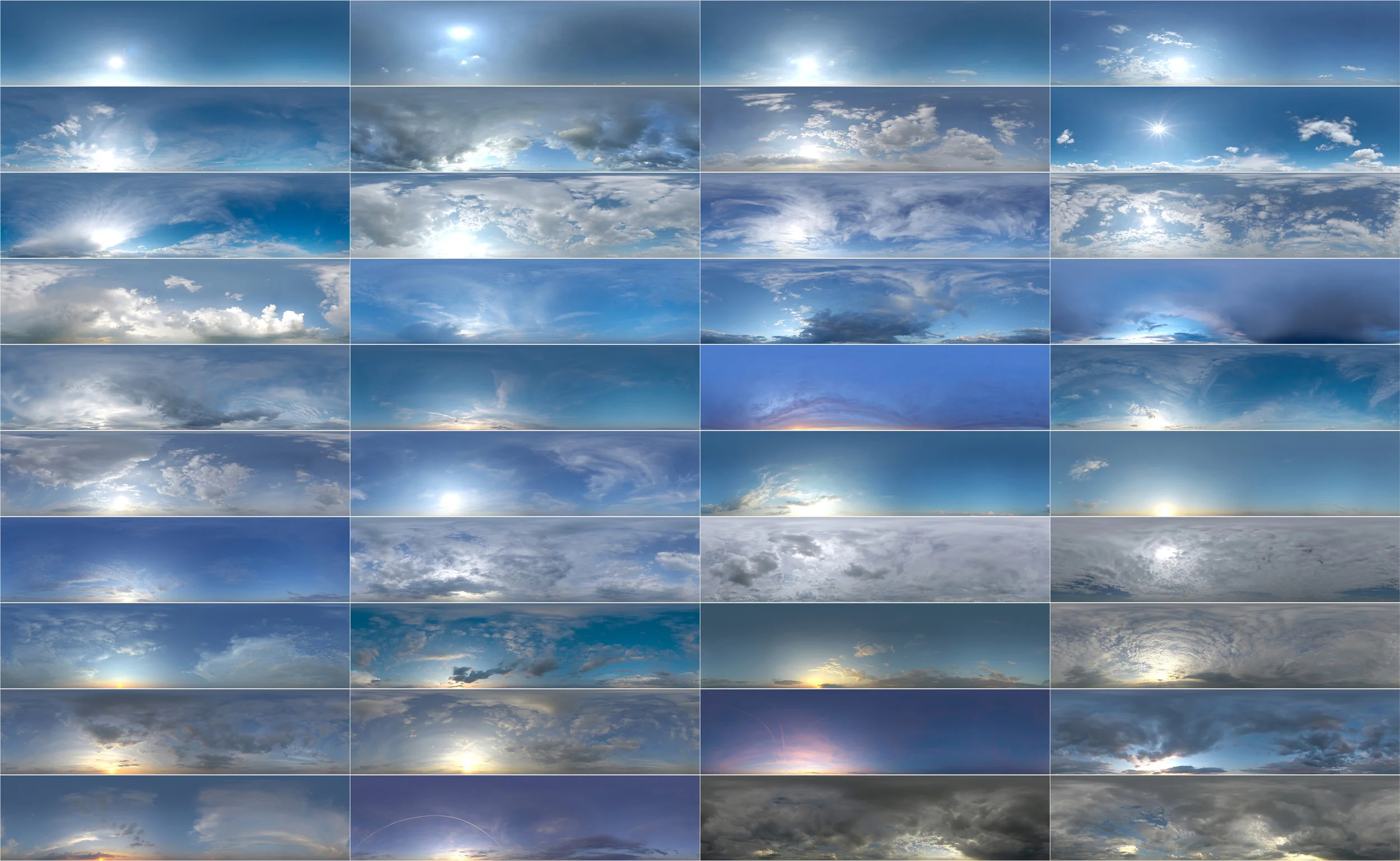
HDRs are a completely different approach to lighting. Instead of using lamps, it uses a single image to light the scene that looks like this:

And while it looks like a standard photo, it actually contains valuable light information (captured in multiple exposure ranges) that your rendering engine can use to create light:

(Remember: this is without any lamps whatsover! It's controlled entirely by a single HDR image.)

They show up in reflections too:

HDRs are the most photorealistic lighting solution, because there's no fakery. It's taking an exact lighting profile captured in the real world, and bringing it into your 3d software.

That's the reason they're used by hollywood and most architectural renderers.

But unfortunately HDR Skies aren't cheap. They typically range from $10-30 each online, which means a modest collection of just 10 Skies would cost $100-300.

Until now!

As of today, Poliigon now has HDR Skies available to all existing and future members. There are 40 HDRs so far with plans to add more in the future. 

And all are available at a whopping 15,000 x 7,500 and 12 EVS :)

Enjoy!

Top Poliigon Renders from December '16

The Poliigon community finished 2016 off with some stunning renders. So as per usual, here's a recap of the best renders made with Poliigon textures, from December 2016.

Light in the Rain, by Max Detournière

Beautiful! Lovely use of the displacement map to create some hard ridges in the brick face. I like the dynamic camera angle too. Adds a lot of interest.

Beautiful! Lovely use of the displacement map to create some hard ridges in the brick face. I like the dynamic camera angle too. Adds a lot of interest.


Keyboard, by Nicolas Martinez

Never before has a keyboard looked so cinematic! The fingerprint overlays really help this look photorealistic. Fantastic work!


The winner is... Anton Yeregui

anton-yeregui-bed3.jpg

Fantastic scene! Everything from the interior design to the lighting is incredible. I really like your use of textures to make the room feel modern, but natural. Just beautiful!

So congrats! As the winner, you've received a full 12 months Gold subscription to Poliigon :D


How to win a year of textures

  1. Make an image that uses at least 60% textures from Poliigon
  2. Post the image on ArtStation
  3. In the description somewhere, write "Textures from Poliigon.com"

At the end of every month, we round up all the images and feature our favorites here. The best image will be awarded a full 12 month Gold subscription to Poliigon.

May the best artist win! :)

New Wood Flooring Collection

Wood is a popular choice for architects, as it's both visually interesting and an easy way to breathe life into the decor.

But when it comes to texturing, wood flooring suffers from the same problem as marble: it's very difficult to capture, and as a result most texture sites have a very limited range.

Unlike concrete or bricks (that are readily available in public spaces) wooden flooring can only be found inside finished interiors. And unless you want to break into dozens of homes, it's unlikely you'll find suitable flooring to photograph.

As a result, most texture sites have a very limited range of interior wooden flooring available.

So instead of giving up, we proactively created them from scratch. We took dozens of photo references then recreated them using Substance Designer. 

And after 50 man hours, we're pleased to present this pack of wood that's identical to photo textures.

Here are all 28 of the new wood flooring textures:

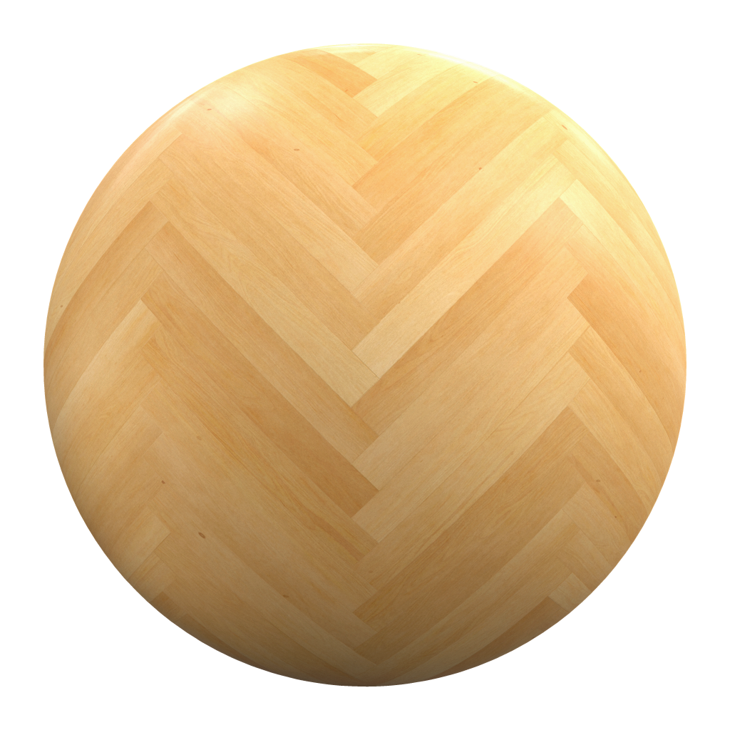
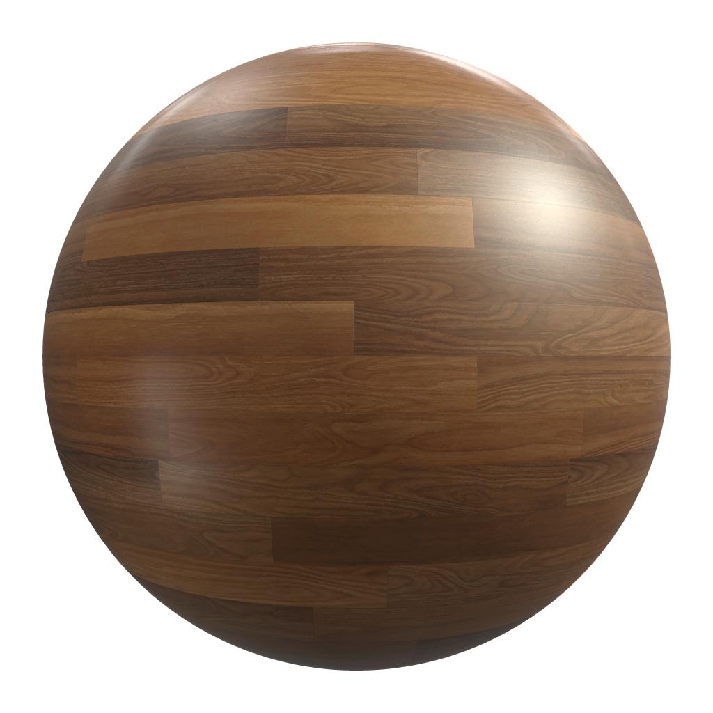
For each texture type we created 3 types of wood: light, medium and dark:

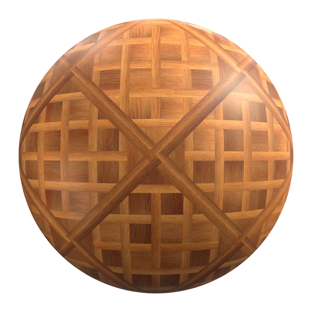
And since we had full control of the arrangement, we went an extra step and created unique wood patterns like diagonal parquets and diamonds, that are very difficult to find online:

These are perfect for architectural use, as well as scene building.

Here's how our in-house artist (Guilherme Henrique) used the new texture collection:

These wood textures are now available, to all Poliigon members. Enjoy!

Bathroom Breakdown

In a recent survey, many of you asked for scene "Breakdowns" to see how textures are used in larger scenes.

So as a trial run, here's the first scene breakdown on a Bathroom made in Blender:

Textures:

  1. Marble65 - Wall
  2. Marble62 - Countertop
  3. Marble59 - Floor
  4. RainDropsComplex - Shower screen
  5. BackDropGreenLeafLarge002 - Tree backdrop


Textures:

If you'd like to see the full workflow on how this Bathroom was created, check out the full tutorial below:

What's did you think of this breakdown idea? Would you like to see more? I'm really curious to hear your thoughts, so please post in the comments below.

The Top Poliigon Renders from November 2016

Another month has passed, so it's time to look back on what the Poliigon community accomplished!

The top renders on ArtStation, using Poliigon textures are as follows...

Created by Timm Schwarze

Created by Iván Zabalza González (also the winner of last months!)

Created by André Mueller

Created by Piero Di Chito

And the winner is...

The render of the month prize goes to Charlie Pradeau!

Created by Charlie Pradeau

A simple scene, but done extremely well. You've made clothespin's both realistic and aesthetically pleasing! Brilliant work!

For your efforts, you've won a 12 month Gold subscription to Poliigon! :)

Want to win a year's subscription to Poliigon and be featured here next month?
Just post your render on ArtStation with the words "Textures from Poliigon.com" somewhere in the description. At the end of the month, we'll go through all the entries and award the best image a 12 month Gold subscription to Poliigon! :)

New Marble Materials

Good marble textures are surprisingly hard to find online.

They're either tiny in real world size (20x20cm slab anyone?) or riddled with highlights.

But there's a reason for this: marble is actually very challenging to capture. 

Marble is heavy and therefore expensive to transport, which means even in the real world most are cut into small pieces. It's also highly reflective, which means photographing it without highlights is nearly impossible.

So rather than photographing them, we tried something different: we collected dozens of photo references and then made them by hand using Substance Designer.

It was a challenge that took 86 man hours to complete, but we're pleased to present this new collection of the best marble textures available online!

Initially we were skeptical that procedural textures could match the quality of photographed ones. But after weeks of fine tuning by our team, we were amazed that they looked identical to photo equivalents. Even zoomed in at 100%.

You can download these new marble materials now!

Look forward to seeing your gorgeous marble scenes!