Yann Verbeke Reviews Poliigon Models and Textures
We asked 3D archviz artist Yann Verbeke to put our latest decor models and interior textures to the test. Here’s what he had to say.
Explore the same Poliigon catalog Yann used in this scene for your own projects.
Q. What inspired you to create this artwork?
Yann: I believe it’s important for one’s creativity to always have one or more ongoing personal projects. Once in a while, I look for inspiration online. I search for nice interior photography - or a series - that I then decide to recreate in 3D.
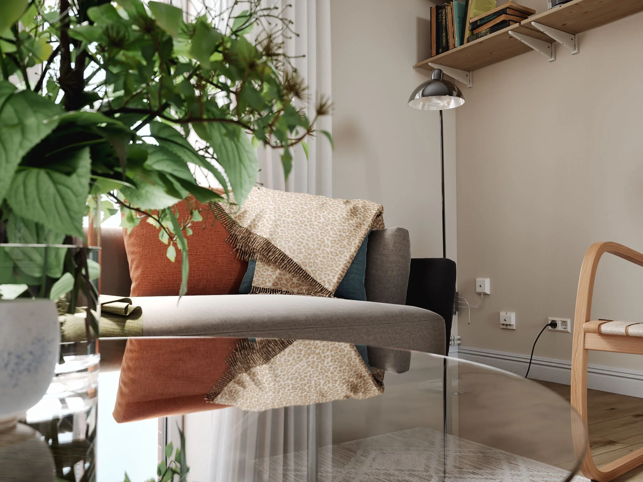
For this project, I mixed two apartments that were both for sale on the Stadshem website.
Q. What did you learn while making this artwork? Were there any 'aha!' moments?
Yann: A challenge I like to give myself is to add some sort of mess in the scene, without it taking too much attention to the eye.
The general mood should be a nice-looking image of a somewhat clean place, but one trick - amongst many others - to reach a point of photorealism is to add some mess; or rather, to not have everything in a place where it ‘belongs’.
Someone made a comment about the stool in front of the table where nobody could sit on, because there’s no room for the legs. It’s true, in a very practical way; but don’t we all move things around in our home that are not always where they should be, or don’t fit where they’ve been left? That stool could be for a kid who’s only there every other week; a story element can be created in this way.
Adding up all these voluntary ‘mistakes’ - from tiny dirt maps and imperfections, to a chair being rotated just 10 degrees compared to being tucked into the table perfectly, or some cable hanging from the wall - all those decisions end up making the whole image look more real…more ‘lived in’.
Q. What were the biggest challenges you faced in this piece, and how did you overcome them?
Yann: I always find it challenging to create a realistic exterior. There are many tricks to avoid having to deal with the exterior when making interiors.
First of all - and you see this very often in most renders - there just isn’t any view of the outside. The other solution, which is very close to real photography, is to blow the highlights and make everything outside burned out. I added a massive 3D building outside and a backdrop further behind in this project…but to be honest, I’m still not 100% satisfied with the result!
Another challenge was making the table. It is made of small wooden beams of 7x7cm that are glued to one another. That means that I needed to model the table in a way so as to have all those parts have different wooden textures, and for each beam to have a different end grain pattern.
Finally, a challenge for every personal project is to finish it! That is the hardest. Professional projects prevail and so time passes; weeks and sometimes months, until it comes to the point where that initial motivation fades away. At some point, I get back into it with the aim to bring it to the finish line.
But the closer I get to the final renders, the harder it is to stop making those final adjustments. My challenge is getting to the stage where we just accept that it’s ‘good enough’!
Q. How did you find using Poliigon’s new decoration models?
Yann: As always with assets from Poliigon, it was really easy to use them in my scene. Most of the time, I place and drop the assets and they look good right out of the box!
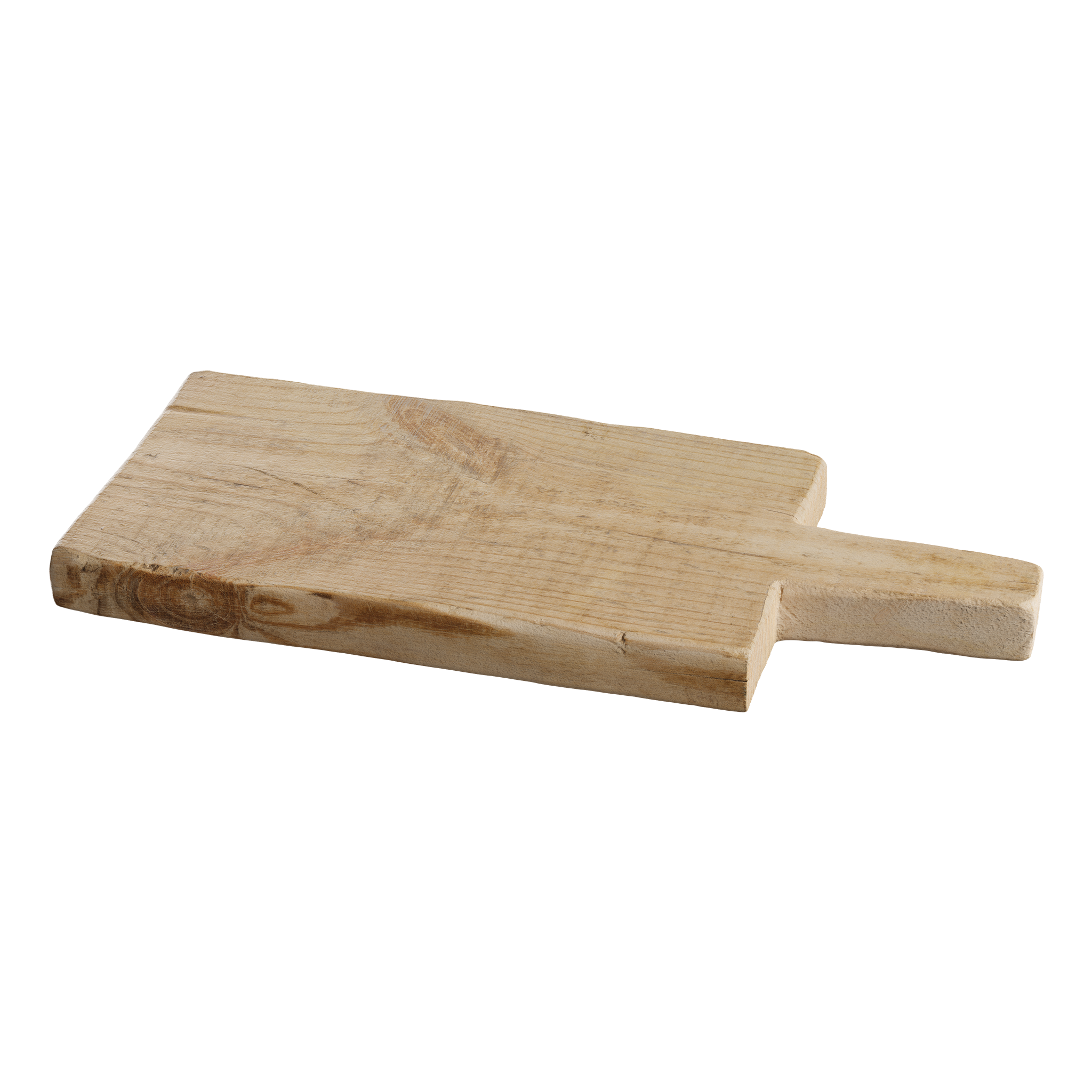
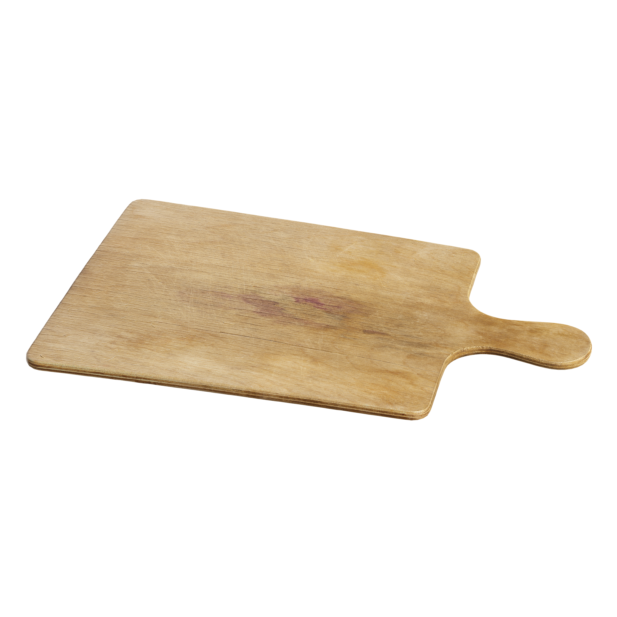
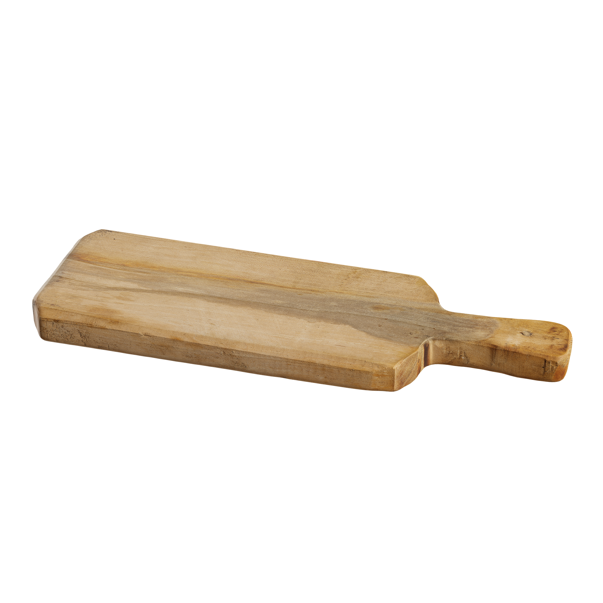
For instance, while adding props on the kitchen countertop, I remember placing the thick serving board, then adding the cutting knife and changing the rotation angle - and in just a few clicks, it was all nicely in place and looking great.
For this project, I used FStorm as the render engine, so I needed to tweak some parameters in the materials - but that’s a habit I have in my general workflow. When I add a texture or a model in my scene, I always double check the materials and make some changes.
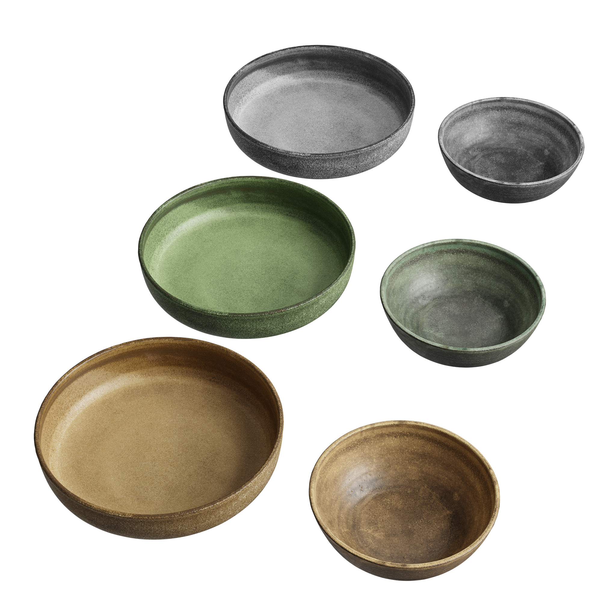
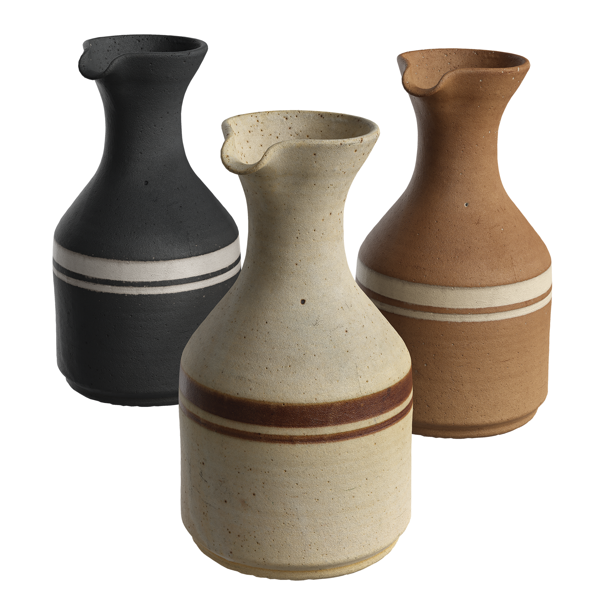
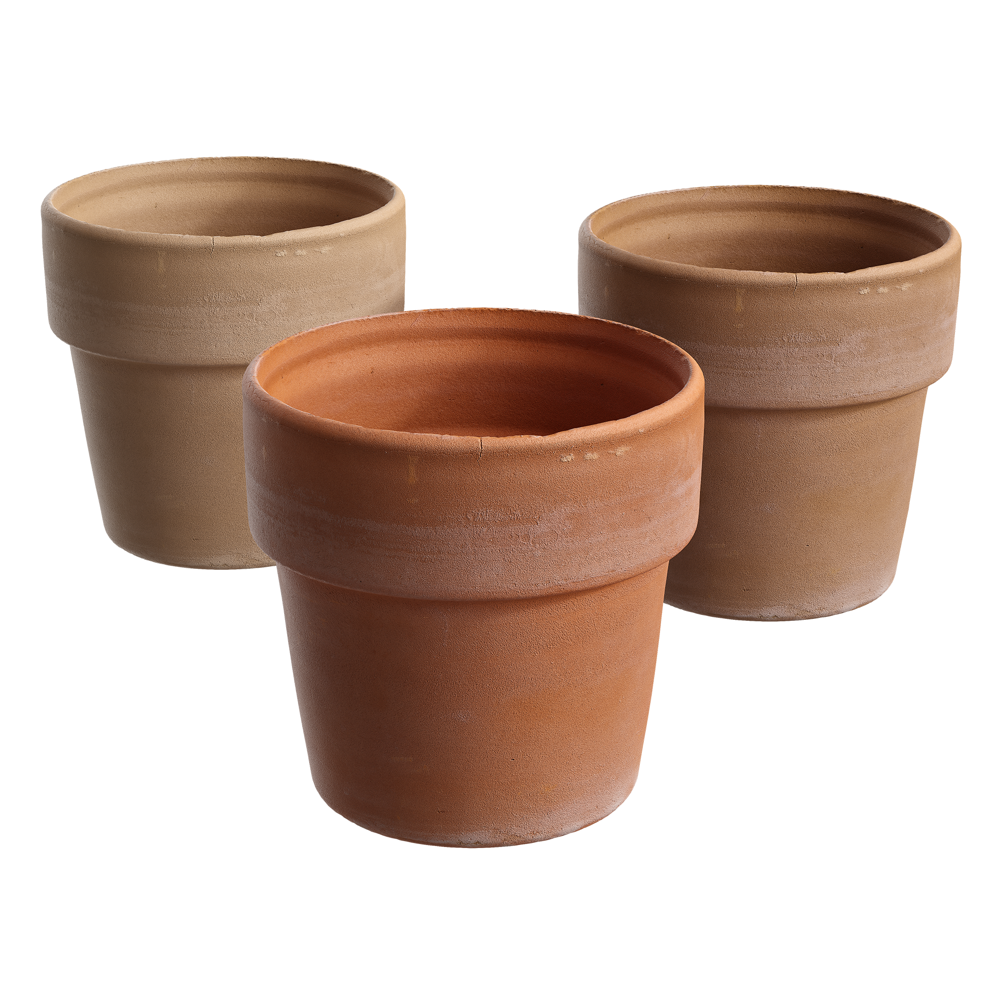
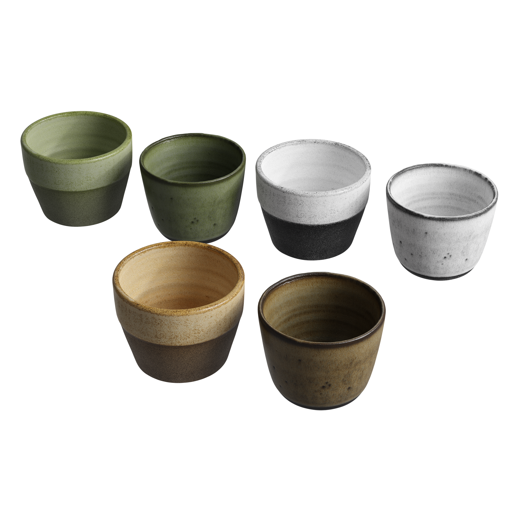
Poliigon models used:
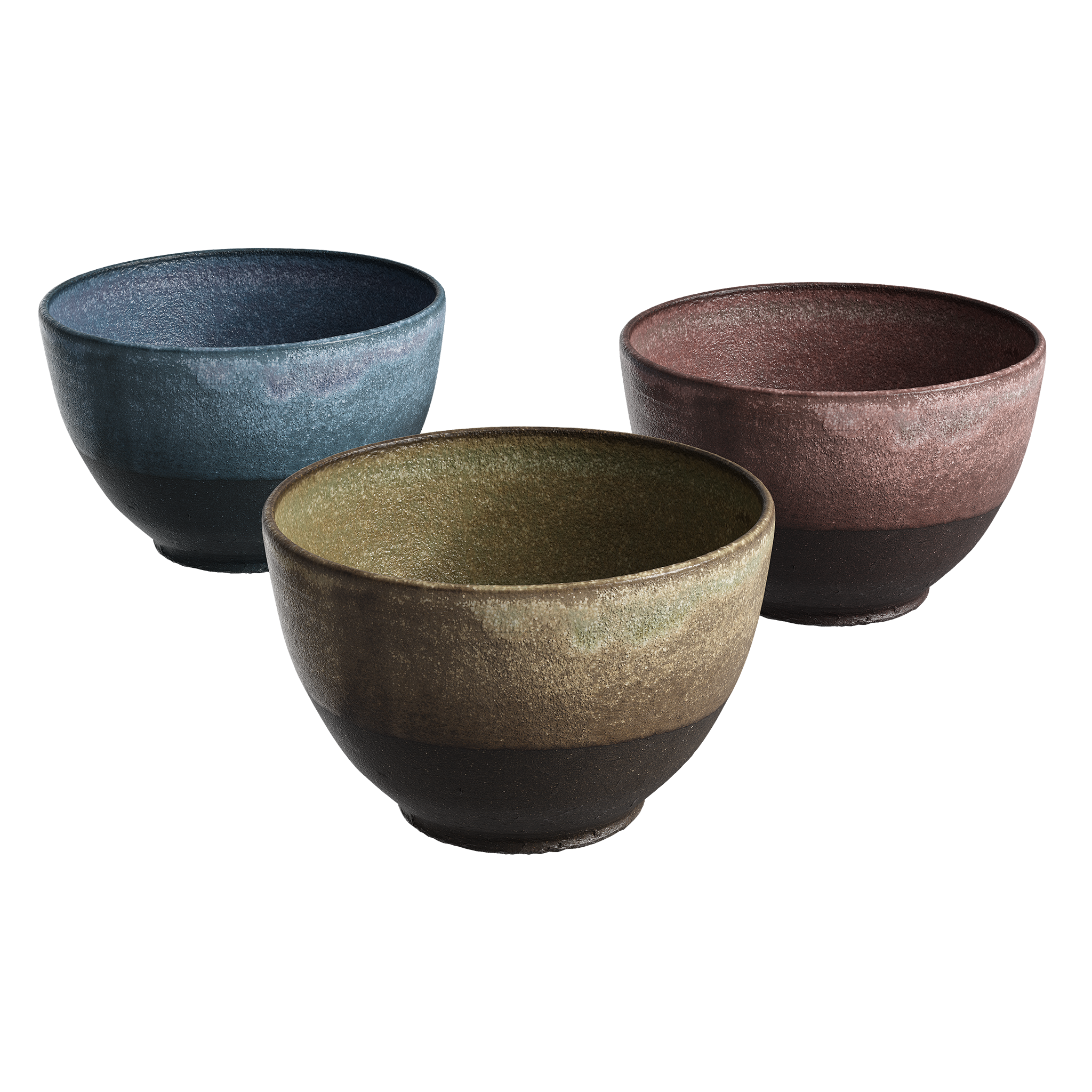
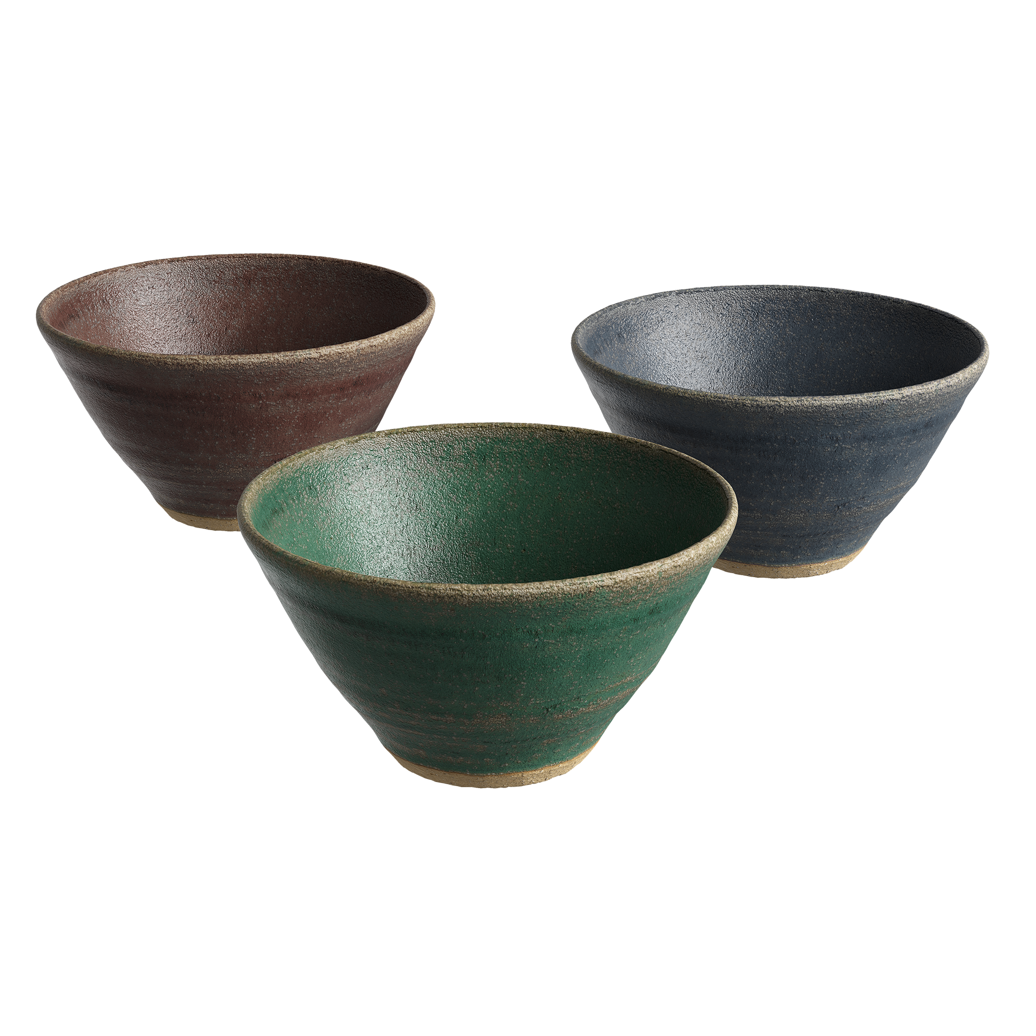
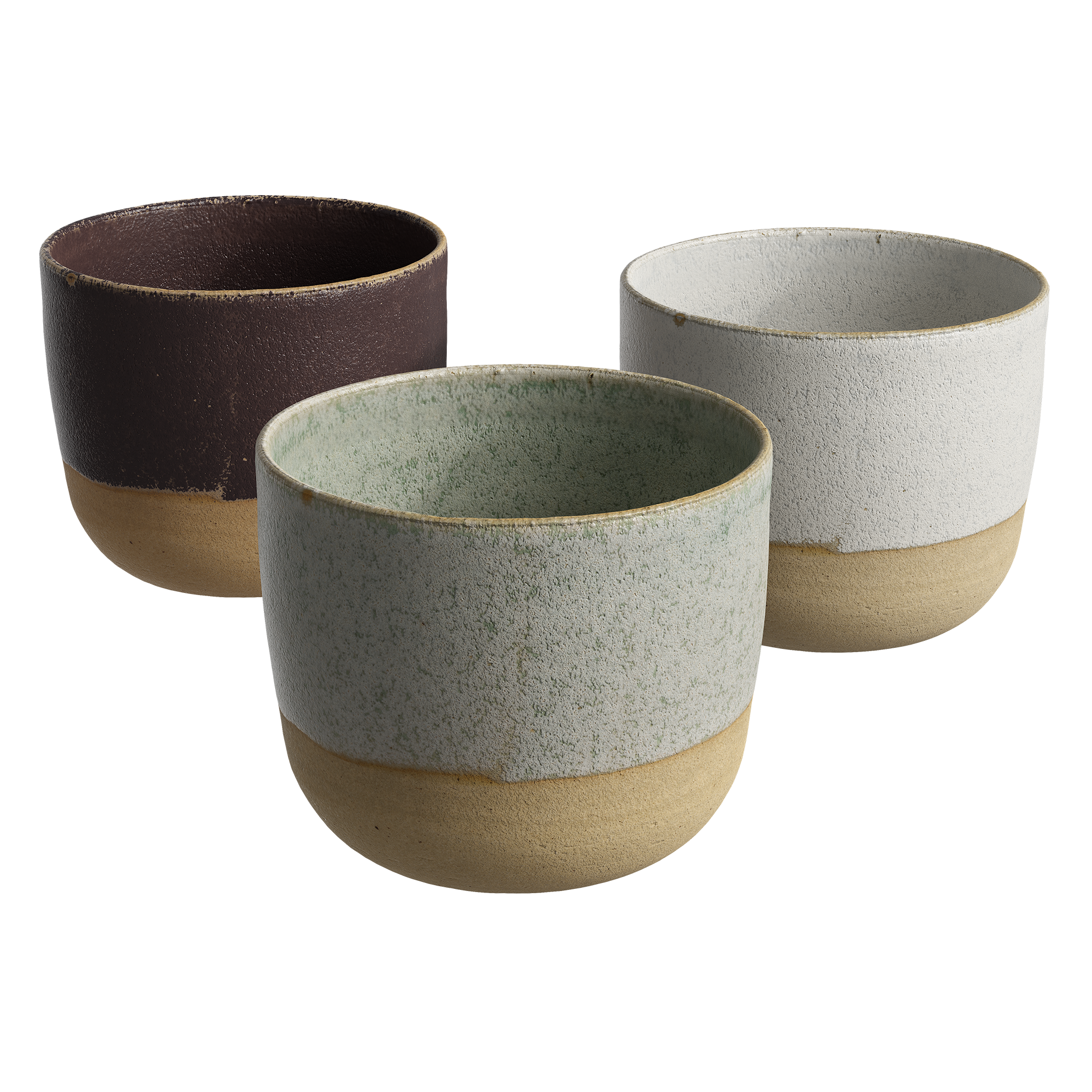
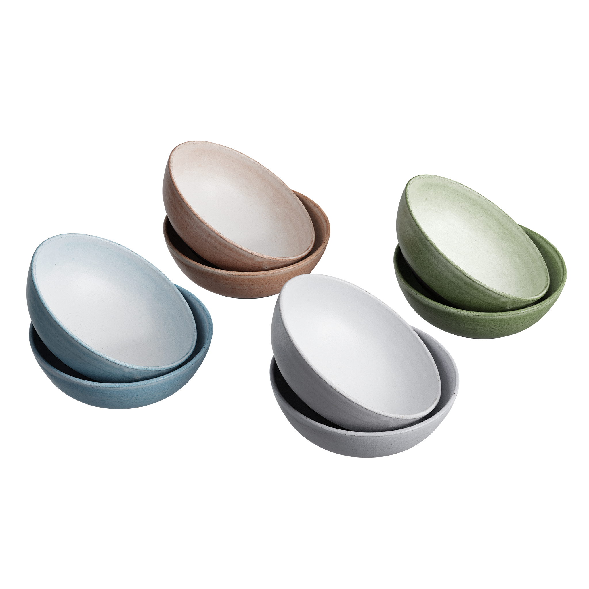
I was really impressed with all the new models that recently came out! Everytime I visit the website, I find new content. When making interiors, we always need fabrics and props for decoration - with the release of the TwinBru fabrics collection and all the new table and kitchen props, it was such a blessing to have such a wide choice of assets to choose from.
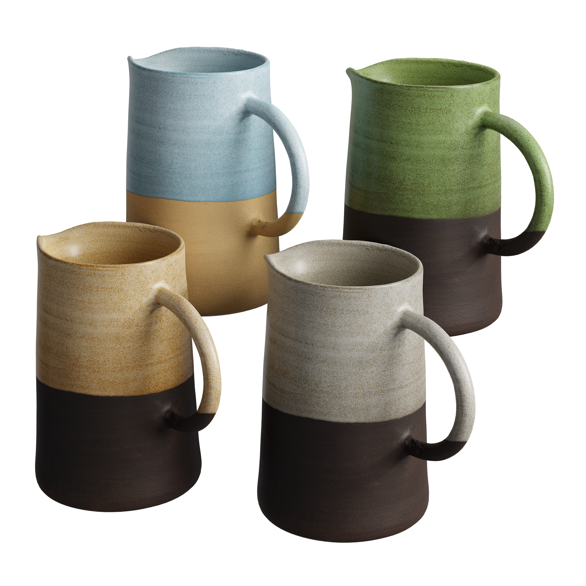
I really like the new cups and bowls models - I like the handcrafted feeling they have. They bring this natural feel to the scene, which is important for me. I’m also a big fan of all the new cutting boards.
Q. How did you find using these new ‘digital twin’ fabrics?
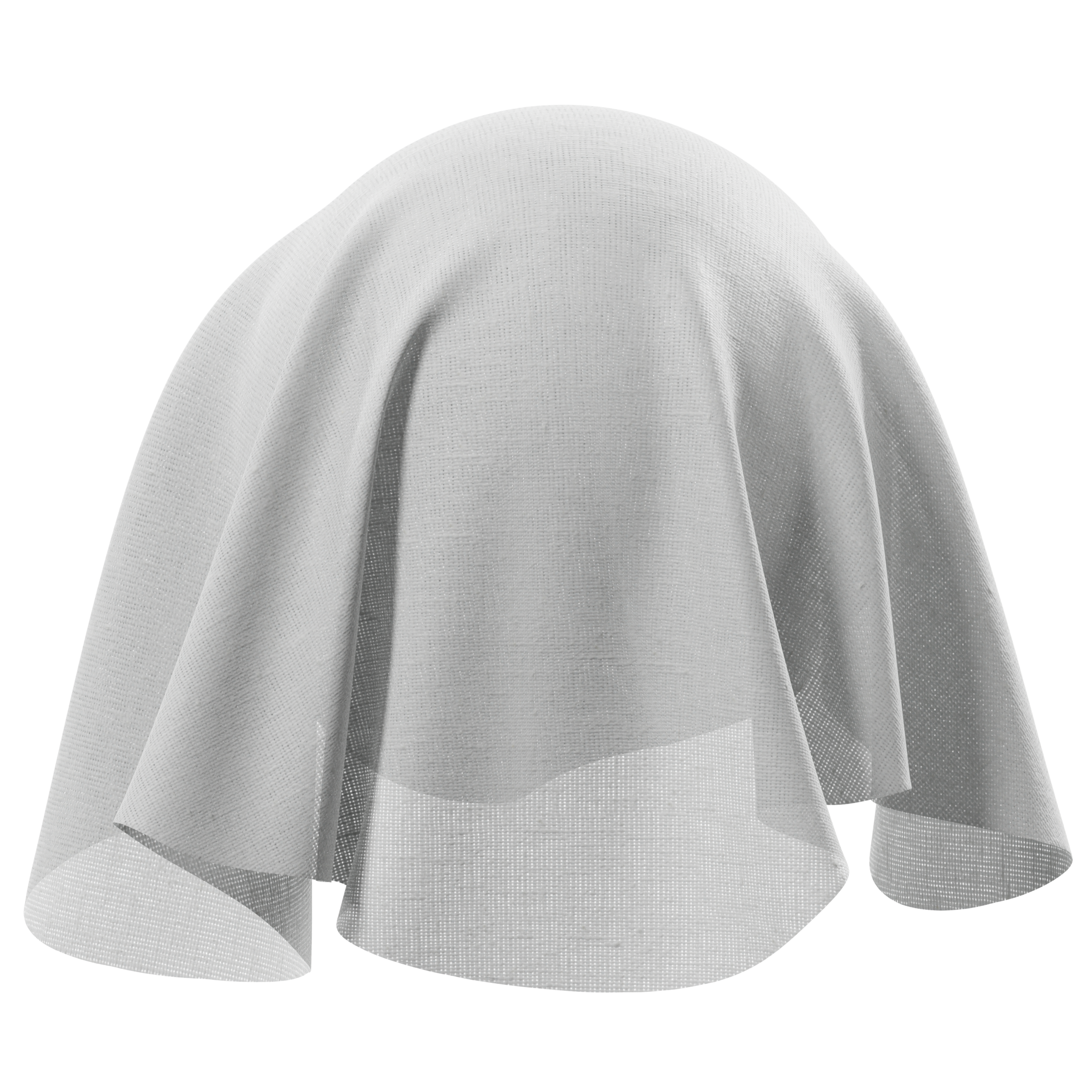
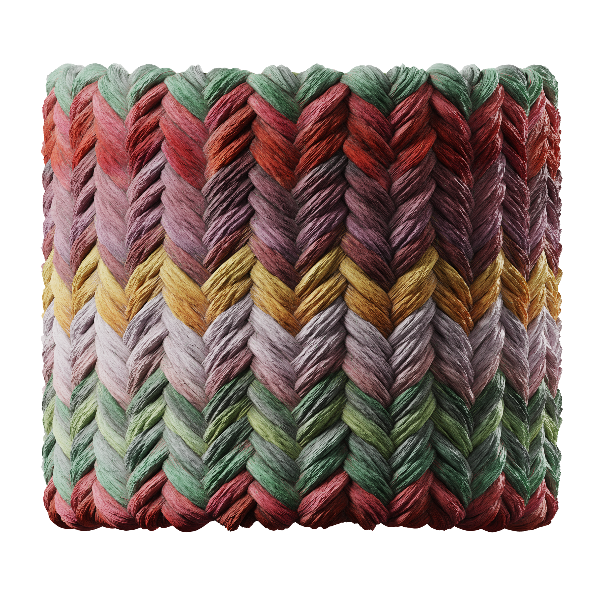
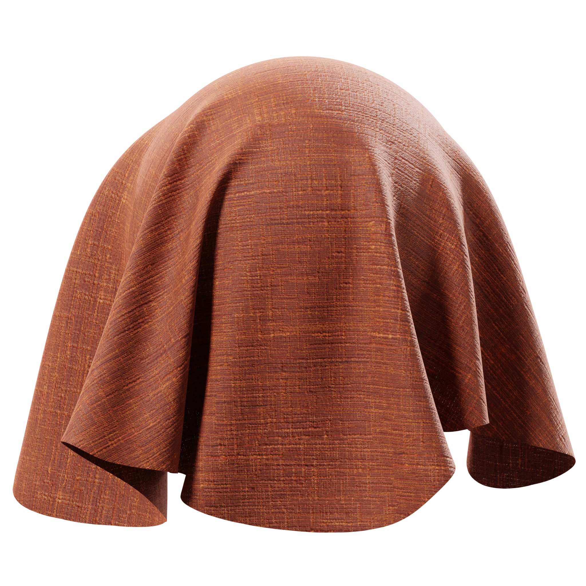
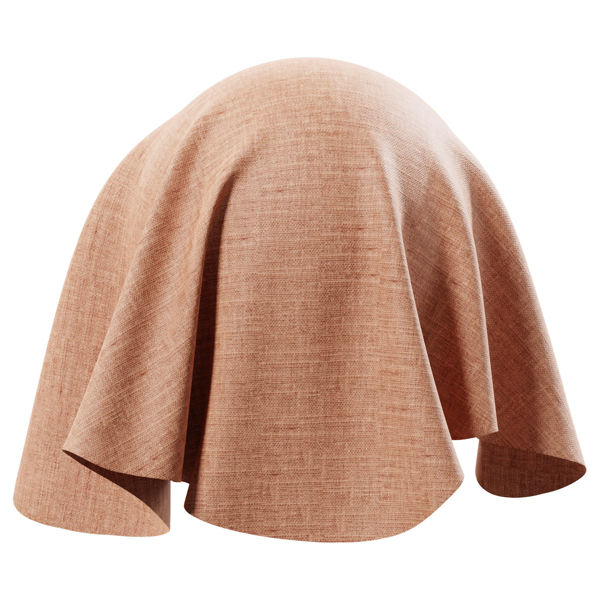
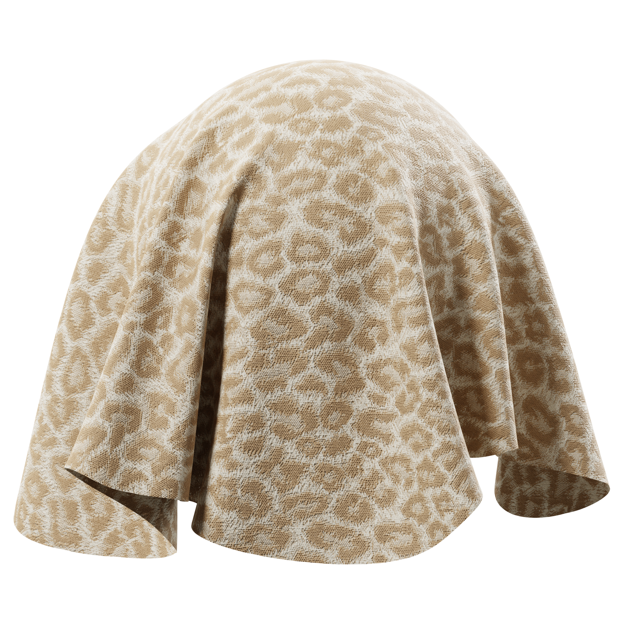
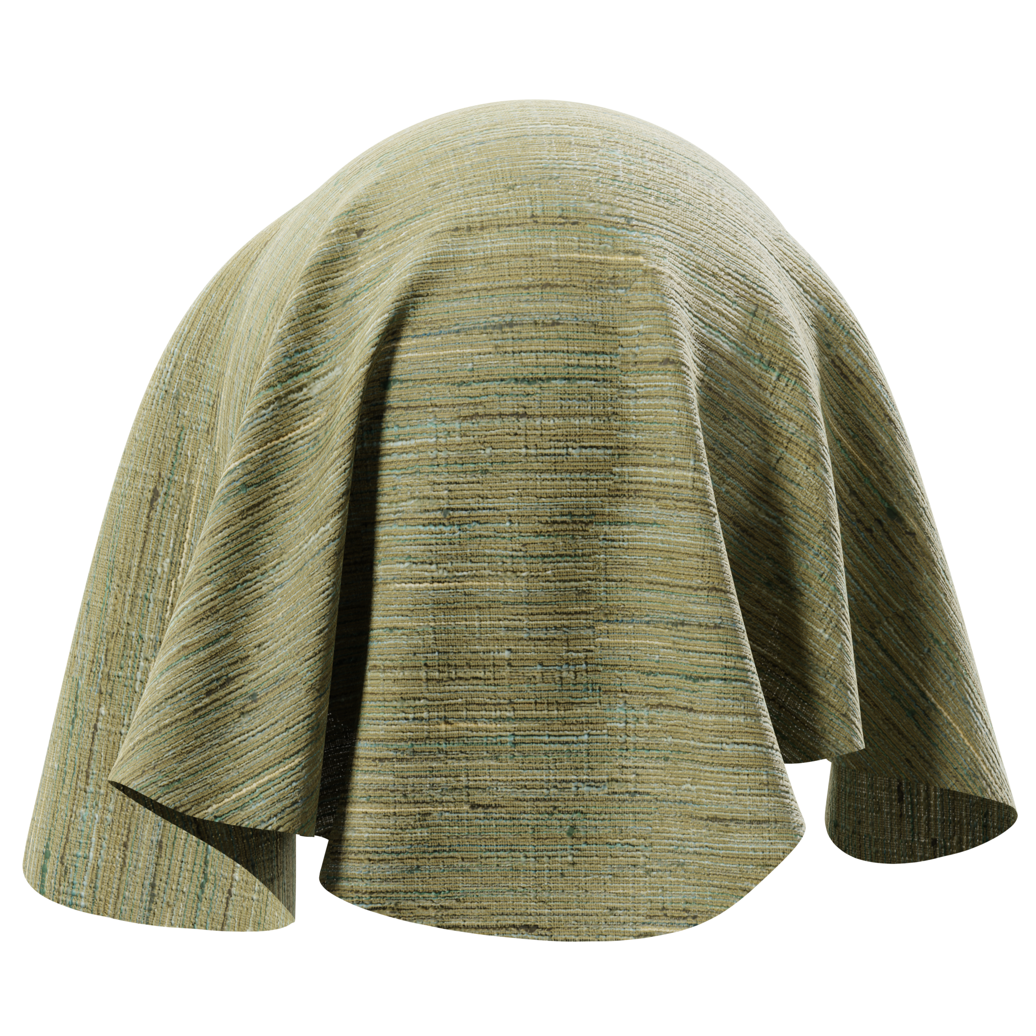
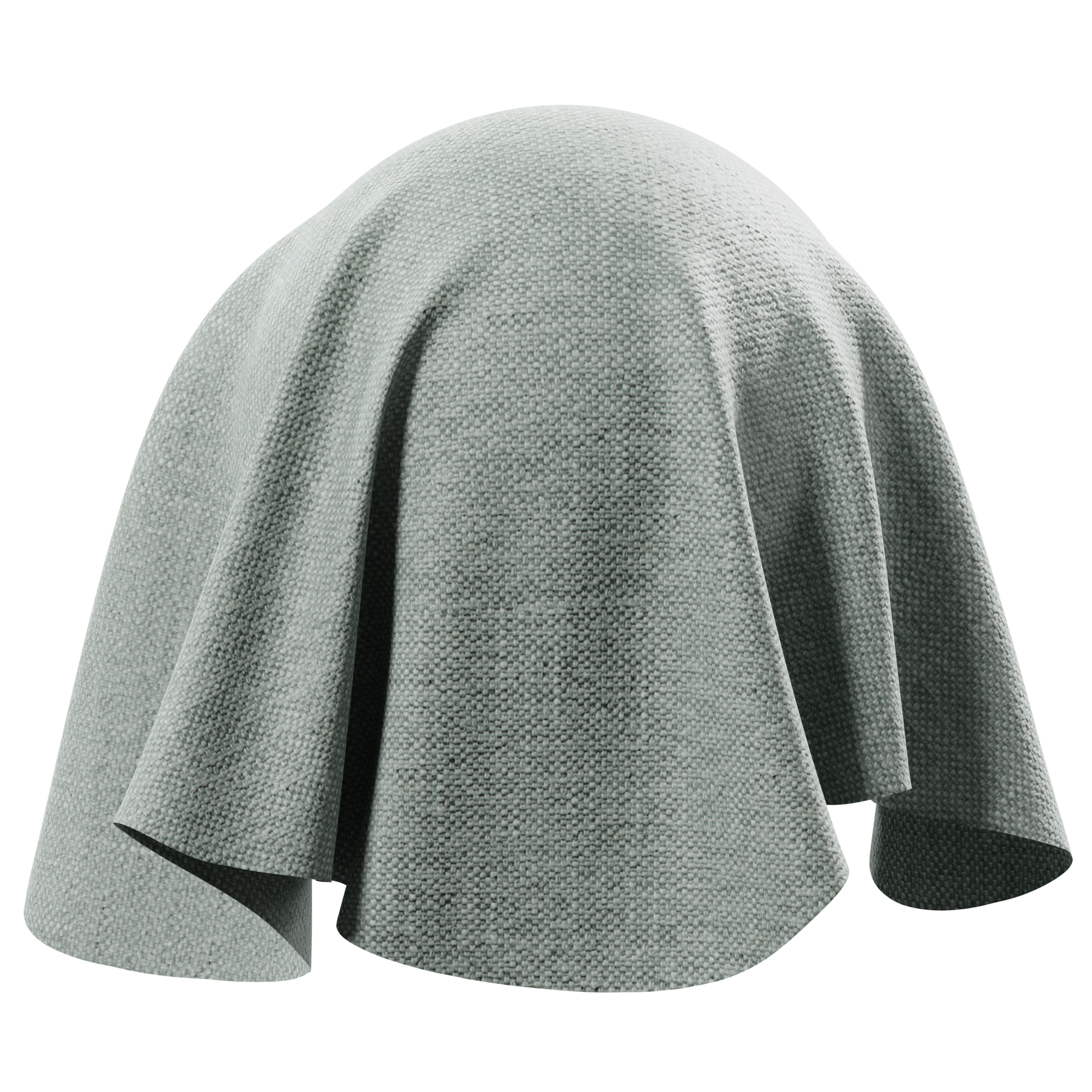
Yann: The new ‘digital twin’ Twinbru fabrics are great and easy to use. It’s very impressive to see the catalog of quality fabrics that Poliigon offers.
The textures are high quality and the sheer number of new fabrics textures is very impressive - almost overwhelming, when having to choose one! But having such a large choice for making nice curtains, cushions and sofa covers is amazing - although they might look alike, they all have their small differences and particularities. There is everything one might need.
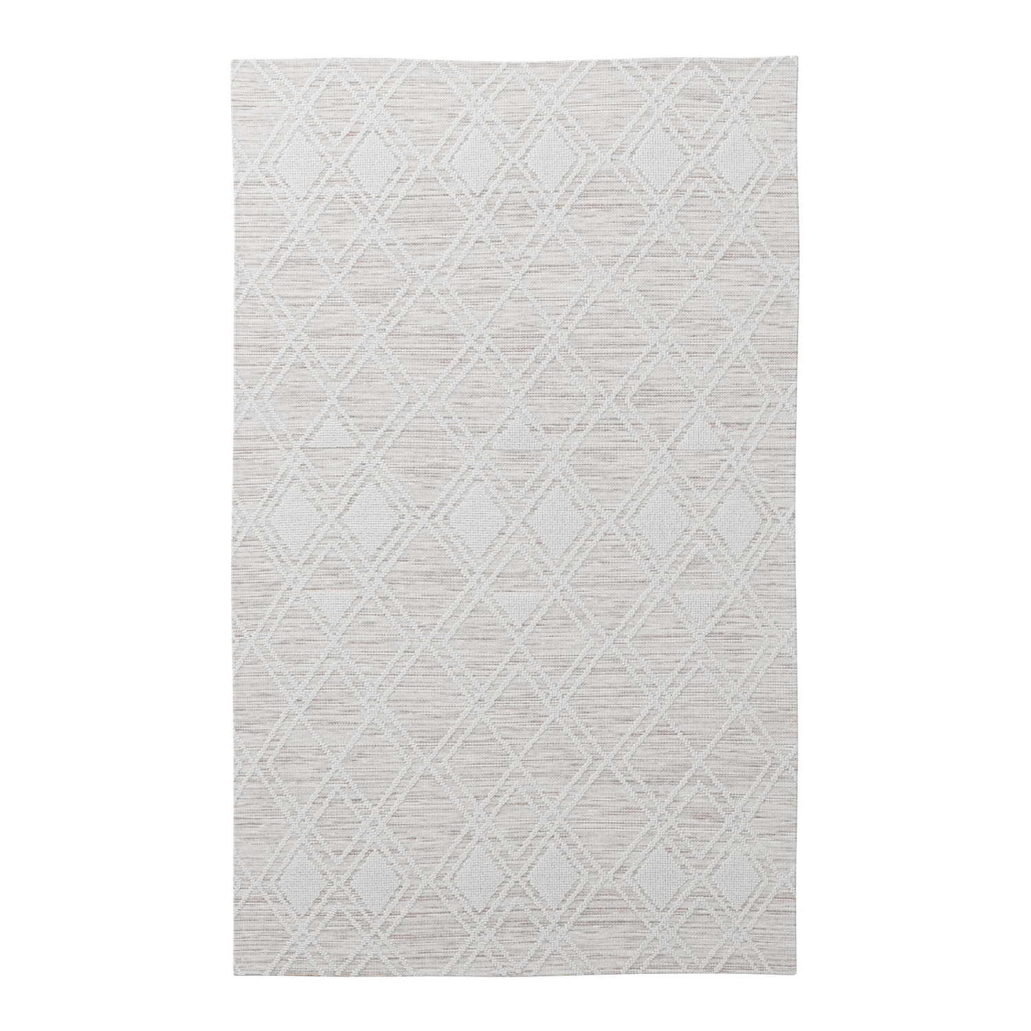
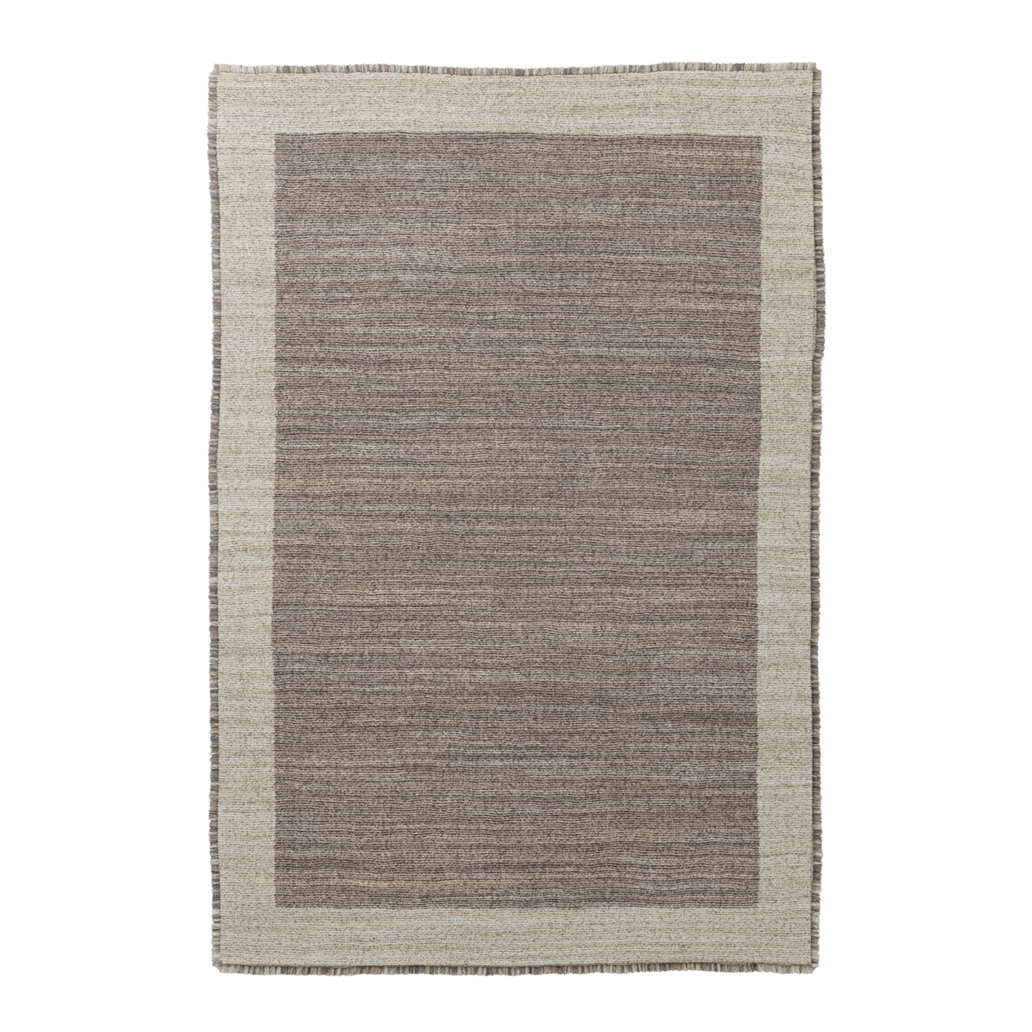
Poliigon textures used:
Q. Do you think the concept of these ‘digital twin’ fabrics, that can then be directly ordered from the manufacturer, will help the 3D industry?
Yann: I think it’s amazing - offering a digital twin of products from real brands is what all 3D artists in the archviz are looking for. And paired with the quality standards of Poliigon, it meets the photorealistic expectations many of us have today.
Q. Would you recommend Poliigon assets to other artists?
Yann: Absolutely. The new models available are interesting, because they are not the common 3D assets one will find on most websites. The latest assets remind me of objects I’ve been 3D scanning myself - things I’ve found at second-hand markets and have wanted to add to my 3D projects!
Q. What assets would you like to see Poliigon release next?
Yann: I very often use Poliigon’s rugs. So often that I’ll soon be needing some new ones!
Q. What’s your process for selecting furniture, decorations and general interior design?
Yann: For a project like this one, where the idea is to re-recreate an existing interior, I search online for furniture and decoration props that look as similar as possible to the ones in the reference images.
If I don’t find exactly what I’m looking for, then I like to model things myself. For this project, for example, I modeled the kitchen table, the glass coffee table and the bookshelf racks on the wall around the door to the bedroom. Modeling is something I really enjoy doing - you start from nothing, an empty canvas, and you start blocking out elements, giving it a shape, adding details, then materials, then imperfections…and after a couple of hours, you get to place your newly designed model in your scene. It’s so satisfying to see it fitting in there so perfectly!
Q. Do you look for specific materials or models that are ready to go, or take whatever is close enough and then tweak them?
Yann: A bit of both, I would say. When I look for materials, I will first try to find one that matches my needs best. From there, I will always tweak the materials - it’s rare that I drop a material on a model without tweaking it, or at least checking that everything looks correct. For the models, I would rather create it myself from scratch, rather than tweak an existing one.
Q. Do you arrange assets yourself (fruits into bowls, using plugins to distribute books on shelves, etc), or look for things that are already neatly put together?
Yann: Most of the time, I arrange the assets myself. This is also the reason that placing props and decoration in my scenes is usually what takes the most of the time.
Modeling the room, placing windows, adding moldings, building the kitchen, are all steps that can be done in a day. But adding small assets - placing cups and plates, piling them and rotating them, adding electric cables - those are things that take a lot of time. I don’t use plugins for automatic and random placing. Maybe I should, but I prefer moving things around myself.
Q. The soft overcast lighting is very nice - what kind of lighting did you use for the scene? Did you use an HDRI or sun?
Yann: Like most of my scenes, I like to only have one single source of light. This is also the case in this scene - there is just one single HDRI.
Q. What tips do you have for artists wanting to achieve beautiful lighting?
Yann: Aside of my work in 3D, I’m a documentary photographer. That experience led me to learn to create images with existing light - and usually from natural light sources. I’m used to composing my photography with natural light coming from a window opening, for instance.
In my 3D scenes, I also like to have one main source of light (the exterior - sunny or overcast) and not add any additional light sources. In cinema, 90% of the shots are made with overcast light (natural clouds or artificial). It’s a nice, soft light that filmmakers love - and one that looks nice on screen. I would suggest the same for those wanting to achieve beautiful lighting in an interior scene; an overcast HDRI is an easy, quick way to have a natural, soft light in your scene.
Q. What kind of tonemapping did you use?
Yann: Most of the tonemapping is done directly in FStorm, except for some small final tweaks of contrast and curves done in Photoshop. FStorm is an amazing render engine when it comes to photorealism, ease-of-use and render time.
Q. What were the general render times for the images?
Yann: In general I would say about 30 minutes. My scenes are heavy, with a lot of furniture and decorations. The textures I use are mostly 4K or more. FStorm does not have a denoiser, so I like to render with a low noise threshold.
Want more from Yann?
Follow him on Instagram
Check out his website
See his work on Behance
See his work on Artstation


