Duy Phan on the making of ‘Gummer’
We speak to Duy Phan to get the low down on his project Gummer and discuss how taking a break from screen-time is the secret ingredient to attaining photorealism in visualizations.
Q. When and how did you get into 3D visualizations?
Duy: Things started back in my high school days when I got too addicted to drawing imaginary comic scenes. My mom discovered that I designed and drew the little buildings I put in my images so she encouraged me to study architecture.
Having to portray and represent my ideas glued me so tight to the chair; it made me ask the question, “how do I convince the project viewer to explore my work further by showing powerful images, just like all the legendary architects and visual artists do?”
The more I refined my project images, the more it helped me to realize my path as an ArchViz illustrator.
Q. What inspires you, as an artist?
Duy: Besides following and studying visual images from profound studios, I love to spend a bit of time everyday exploring photography sites such as Flickr and Unsplash. I train my eyes to see how all physical elements attach together in a beautiful shot. At the same time, I note interesting moods that are present in the more adventurous photographers’ work.
I also keep these random inspirational images in a Cloud drive, where I can access and note any ideas I have during my free time. Later on, when touching base with a specific image, this resource helps remind me of some concepts, and I explore whether it could fit the project brief and is worth developing further.
Click on the blue image hot-spots to find the Poliigon assets used.
Q. What has been your favorite recent artwork?
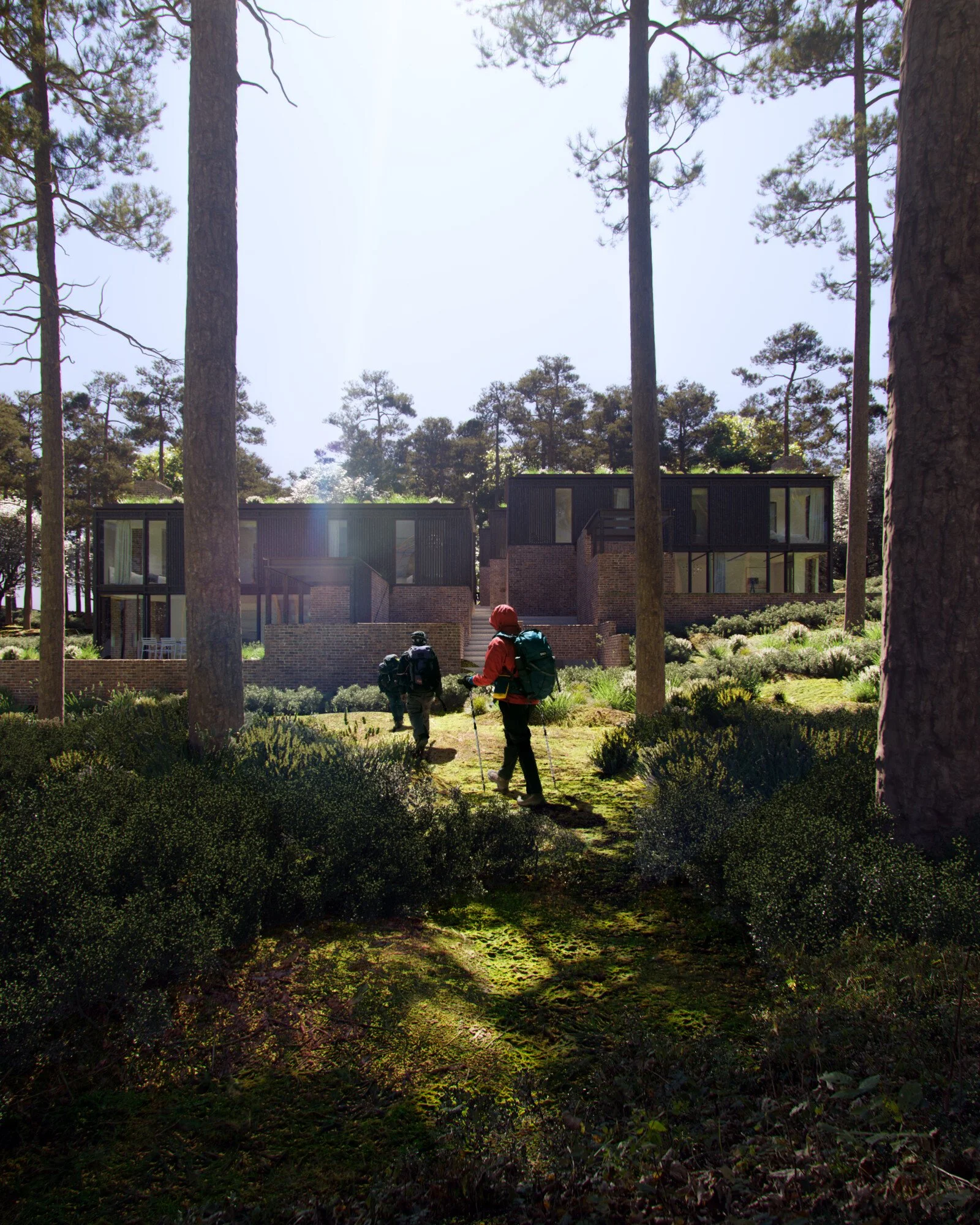
Duy: ‘Gummer’ was a recent project that came from an urban proposal (‘Aquarevo’, designed by Xpace.cc) that sought an up-scaled, low-rise perimeter block approach, suggesting a large open space at its center. The proposal included linked housing typologies that benefited from a huge landscape that brings cooling, ecological lifestyles and additional amenities into the backyard; housing typologies that were flexible within their footprints, following the natural boundaries of the site.
The concept of ‘living around the forest’ aimed to combine the density of suburban contexts, whilst increasing the scale and quality of the public amenities. This image interestingly became my favorite one, partly because of the angle that I don’t usually do. The view’s intention is to show how the built structure interacts with nature and people occupying the marriage spaces between these two.
I used Brick Brown Multi 001, Wood Planks Natural 003, Road Dirt 004 and City Street Sidewalk 007 from Poliigon to complete this render.
I really like that Poliigon’s textures are always seamless and that the shading works 99% from the get-go. I think it would have been a lot harder if I’d have done this image without Poliigon.
Q. What did you learn whilst creating this artwork? Were there any ‘Aha!’ moments?
Duy: Working through this image, I discovered that to create the distance effect by using ZDepth in post production, I needed to apply a solid color of the sky (usually cyan or blue) on top of this ZDepth.
Without it, it can create a very smoky and hazy atmosphere, which you can see in the below example:
Q. What is your typical workflow for creating a visualization?
Duy: Usually, if I’m not provided with a finished 3DS Max file, I model things up in Sketchup. Applying Poliigon textures in Sketchup allows me to forecast the appearance of how material UVW & color go together, without worrying too much about shading at this stage.
Since exporting Sketchup to 3DS Max seems to work pretty good for me so far, I tend to use Ruby, a Sketchup plugin, to build up my scene with doors or windows.
For any organic design form, I’ll have these modeled up in Rhinoceros and everything will be coordinated in 3DS Max eventually.
Q. What’s been the most important lesson you’ve learnt as a 3D artist, that you’d pass onto other aspiring artists?
Duy: Recently, as I have been trying to improve my work, I realized I learn so much more when I’m away from the screens and immersing myself in the outdoors.
I used to walk through a park, a beach or a hill without asking or wondering why things are the way they are. After taking this path more seriously, I keep reminding myself to be more curious about my surroundings, waking myself up to understand the norm that convinces me ‘this is the real nature’.
I believe being more environmentally sensitive helps the artist bring the ‘soul’ back into the artwork. Saying all this is me trying to encourage us to not only spend more time walking outside, but also doing ‘nothing’ and asking ‘why’ and ‘how’ more often!
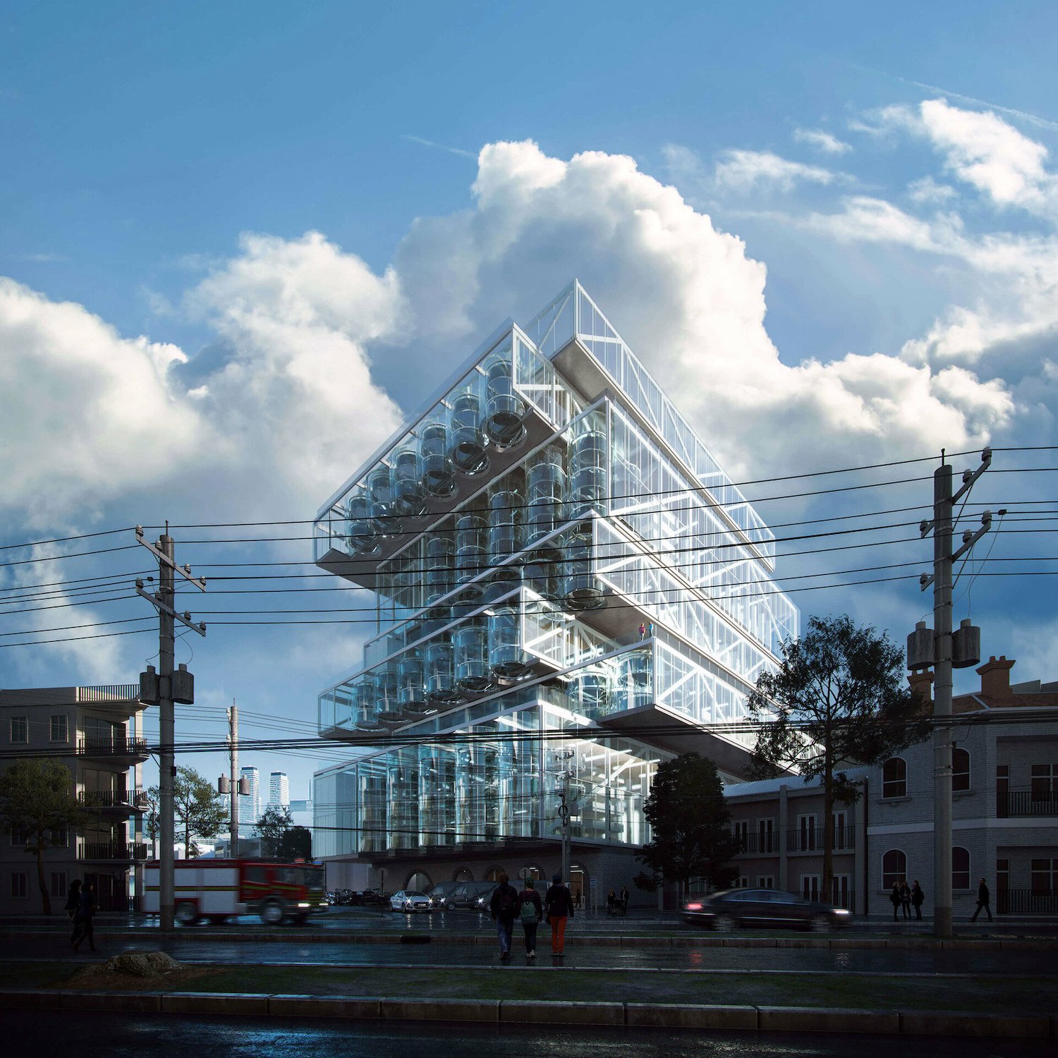
‘Orchard Jenga’, thesis project by Duy Phan.
Q. How long have you been using Poliigon?
Duy: I’ve been using Poliigon since 2017. When I was in the first year of my Masters course and working on my thesis project, ‘Orchard Jenga’, I discovered Poliigon through a 3D forum where many artists share tips and tricks in their workflow.
Since I started using Poliigon, I simply don’t wanna go back. From quality to convenience, I’d recommend Poliigon to any friend of mine who’s working in 3D visualization.
Some of my most favorite Poliigon assets include:
Q. What are three other artworks people should check out, if they’re interested in seeing more of your work?
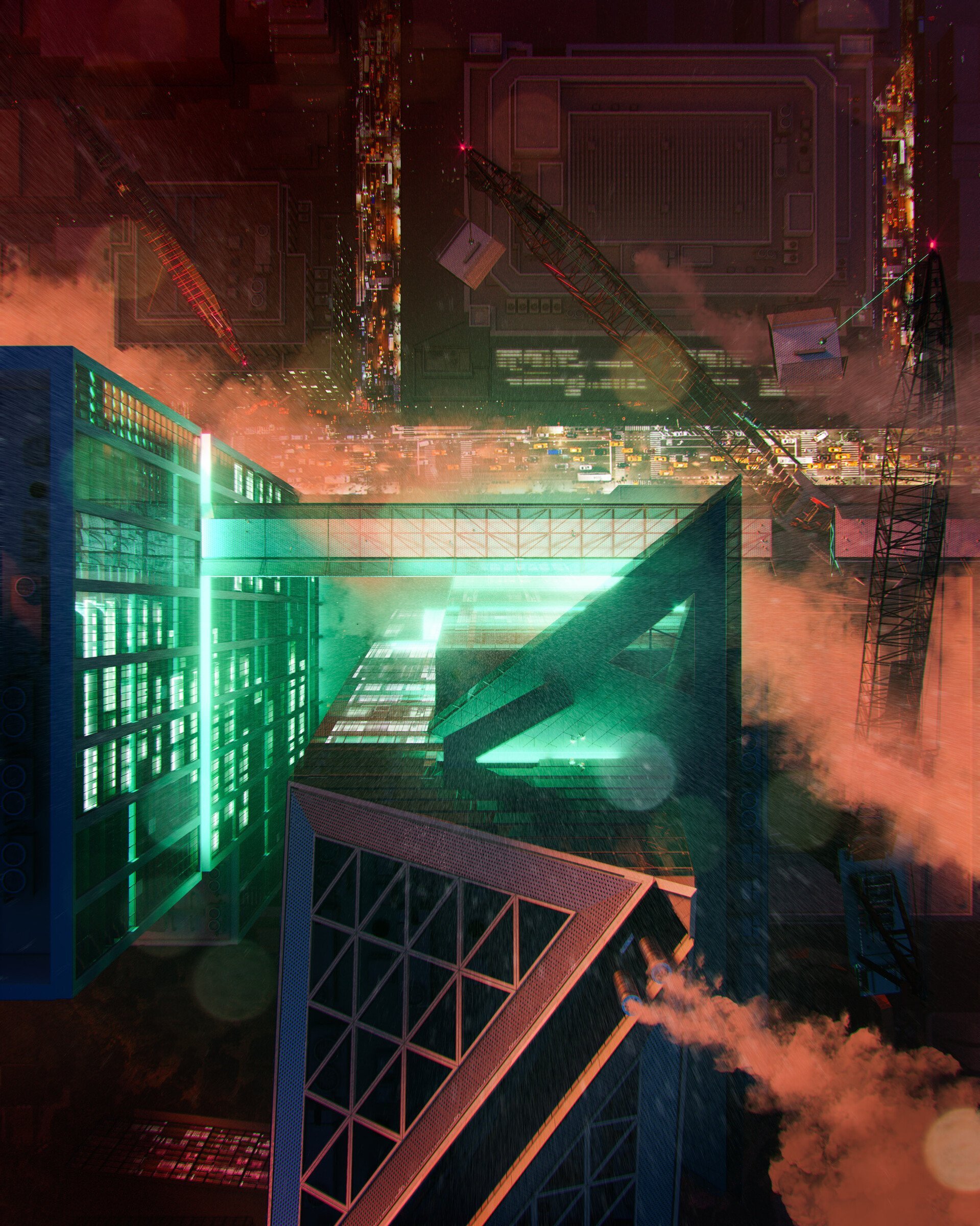
Duy: Some of my works that I am really proud to share include ‘Emerge’, ‘Construct’ and ‘Back’, which was selected as a Poliigon Render of the Month.


